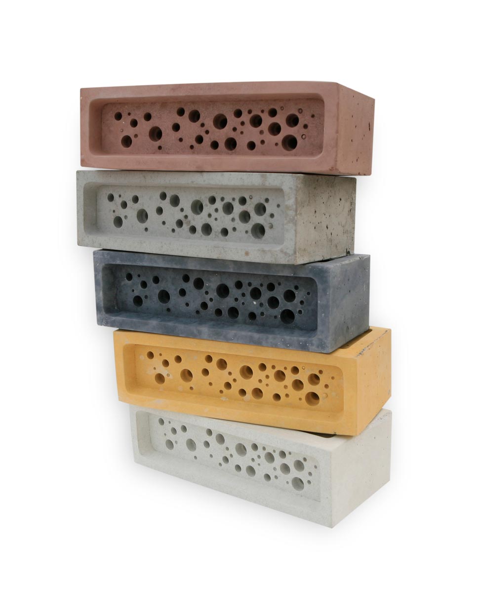
In 2014, Green&Blue began producing bricks with holes that can serve as homes for solitary bee species. These bee bricks are the same size as regular bricks, but they have a series of narrow holes much like the spots where solitary bees nest.
One-third of the world's food production depends on bees and other pollinators, and one in ten bee species in Europe is on the brink of extinction. This is due to climate change, the use of pesticides that are harmful to bees, and the disruption of the natural ecosystem.
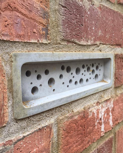
Earlier this year, the city council of Brighton and Hove in England required developers to include bricks with holes for bees in the façades of buildings five meters tall and higher.
Supporters of the initiative believe that such simple solutions will improve the situation and create more opportunities for biodiversity.
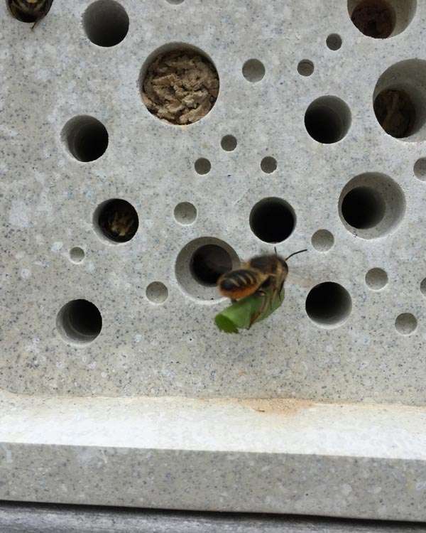
But a number of experts have spoken out against it. They worry that mites and bacteria could breed in the holes and increase the spread of disease. Professor Dave Goulson of the University of Sussex believes that the holes are not big enough to make a good home for bees, and that a single brick, even one in every house, is nowhere near enough; it can only serve to ease one's conscience, with no real benefit.
I think bricks with holes may not be ideal, and they are certainly no cure-all.
But it is better to do something than nothing.
Using such bricks can make a difference, however small, alongside measures like increasing planting areas and so on. And using them widely in new buildings could help gather statistical data and prove or disprove how effective they really are.