Here's a tip from a recent project.
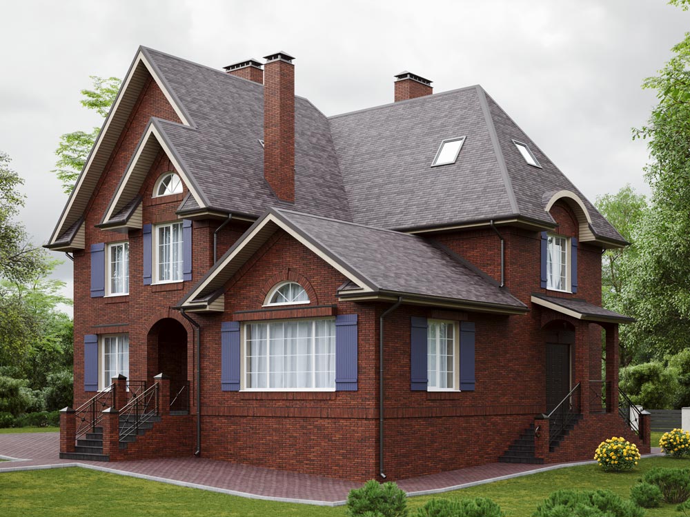
My headache was the blank side wall on the second floor. It stuck out too much and looked out of proportion, so I added fake shutters to suggest a window opening. That made the facade more harmonious and cohesive.
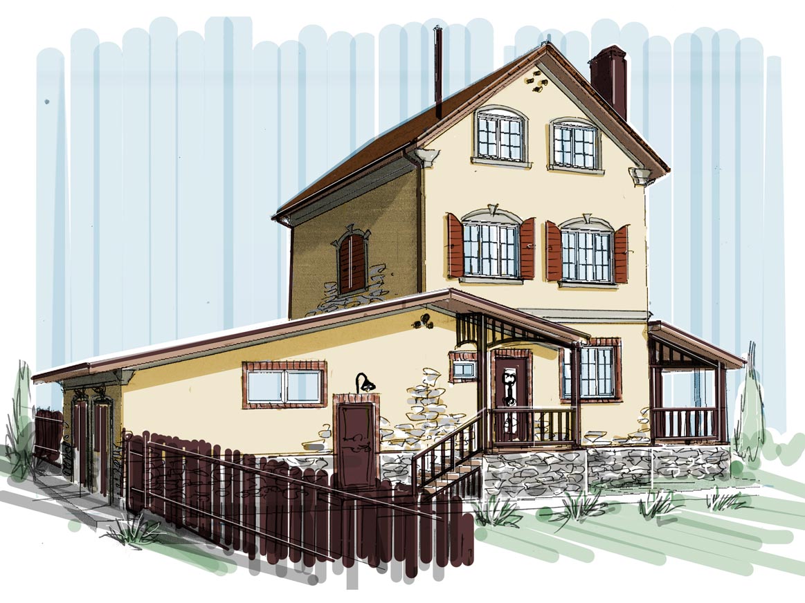
And to soften the impression of the home's additions sitting at different levels, the stone base rises up into the walls in a few spots.
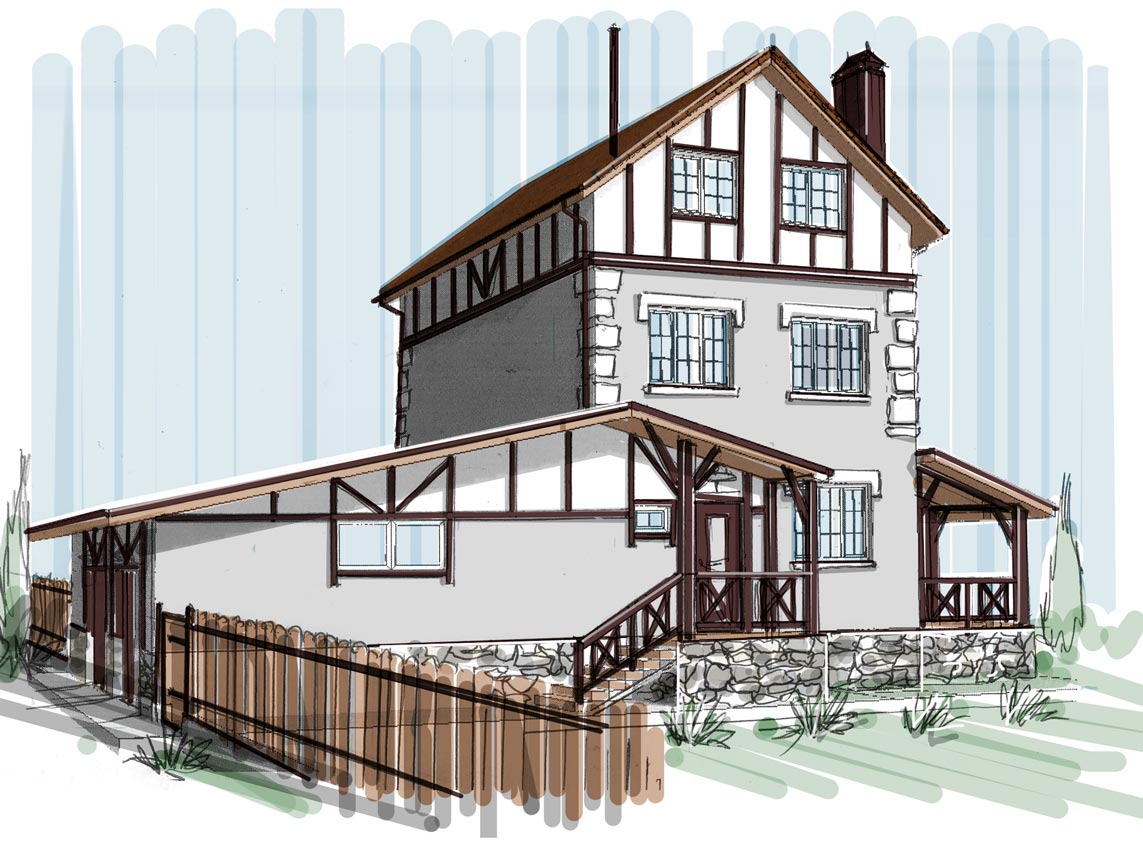
Another option that came to mind was styling it as a half-timbered house. This makes the house look more austere and pulled together, partly because of the cooler gray color. The decorative beams on the facade match the wooden railings on the porch.
I honestly can't decide which option I like better, but the client has already made up his mind—he prefers the first one.