
Here's a look at the techniques I used in a recent project.
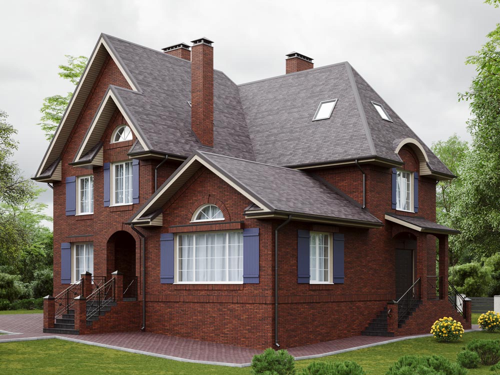
First, the sharp gables and stone trim already nod to the Tudor style.
Second, the refined color combination of blue shutters and reddish brick. You don't see this pairing much around here — and for good reason, in my opinion. The roof is graphite, the most discreet choice, so it doesn't pull attention away from the rest.
Third, instead of the classic decorative surrounds around the windows, there's decorative vertical brickwork.
Fourth, that same band of brick acts as an informal boundary between the plinth and the wall, and also serves as a crowning cornice under the roof.
Fifth, a clean, restrained pattern with no unnecessary curls on the wrought-iron fencing.
I think we ended up with a good example of style that speaks to the present day.