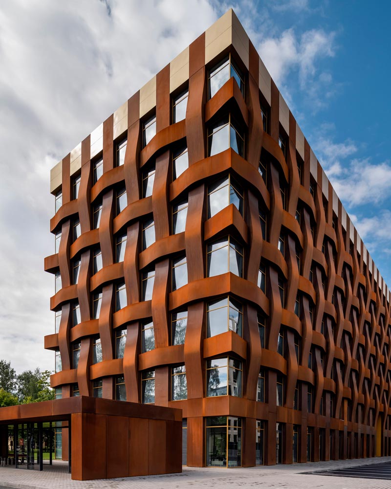
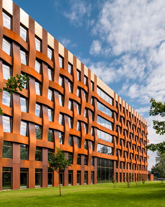
Russia's first building with a COR-TEN steel facade has arrived.
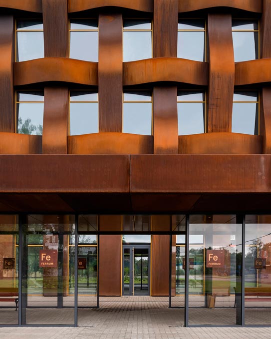
It's the Ferrum Business Center in St. Petersburg, built on the site of the former Rossiya machine-building plant.
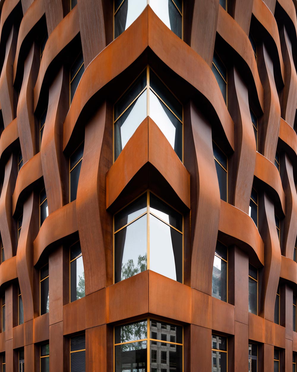
So what's so special about this material? It's a composite alloy that is highly corrosion-resistant and extremely strong, which is why it's also called "eternal" steel.
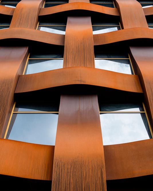
It has a velvety texture and a distinctive rusty-red patina. The secret is that its dense oxide film (the rust) acts as a protective shell that keeps water from penetrating any deeper into the metal. Weather resistance matters all the more in St. Petersburg's climate.
Interestingly, the patina doesn't appear right away but develops over the course of use, which means the building's look changes over time. There are even special treatments for creating the oxide film in a controlled way.
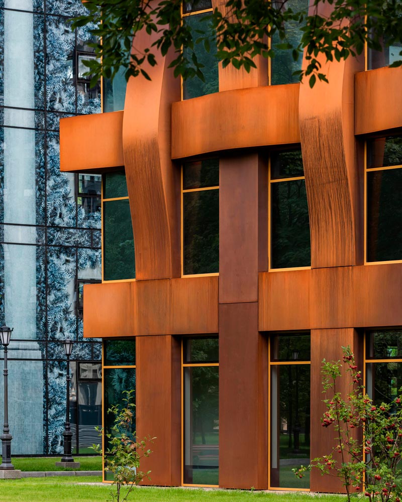
To give the office building's plain rectangular volume a distinctive look, the architects alternated flat and protruding steel modules, creating the illusion of weaving wrapped around a glass base. It looks like either the floating threads of a woven "warp and weft" fabric or a basket made of birch bark.
The Ferrum BC is just one part of a large-scale redevelopment of the industrial area. For instance, there's already a building dedicated to the theatrical work of the artist Alexandre Benois, known from Diaghilev's "Ballets Russes."
The designs were developed by the architecture firm TCHOBAN VOSS Architekten.