Nicole Climanova

The Geisel Library (the main library of the University of California) was designed by William Pereira in the late 1960s. The appearance was conceived as hands holding a stack of books, but at the building also resembles the crown of a tree.

The image was so memorable that it immediately became the emblem of the university.
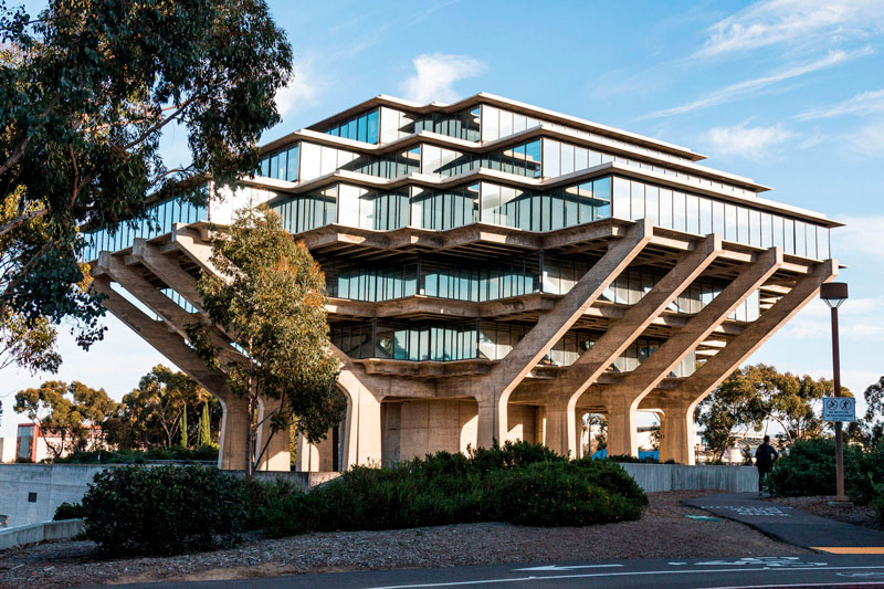
This building, which contains around 7 million books, is an example of brutalism in architecture, a movement in the 1950s and 1970s that began in Britain but rapidly became international.

Le Corbusier is considered the inspirer of this trend, because the term "brutalism" comes from French béton brut — «untreated concrete». Le Corbusier used in many of his buildings, which implies not only the absence of a facial finish, but also the preservation of the texture of the technical imprints of the formwork.

The Brutalist traits include functionality, scale, massiveness, geometricity, boldness and complexity of composition, the lack of finishes, and the use of concrete as the main material.

Nicole Climanova
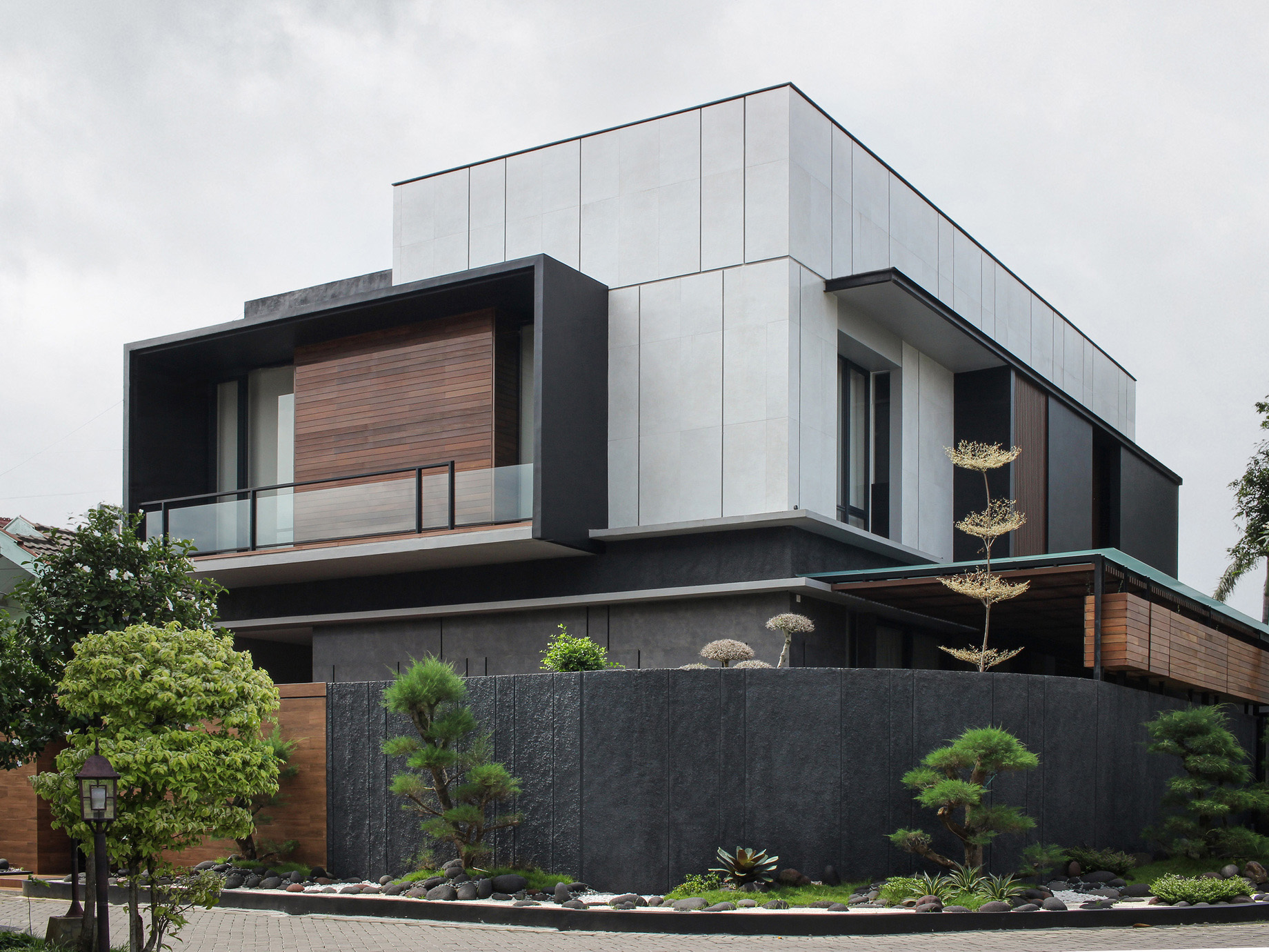
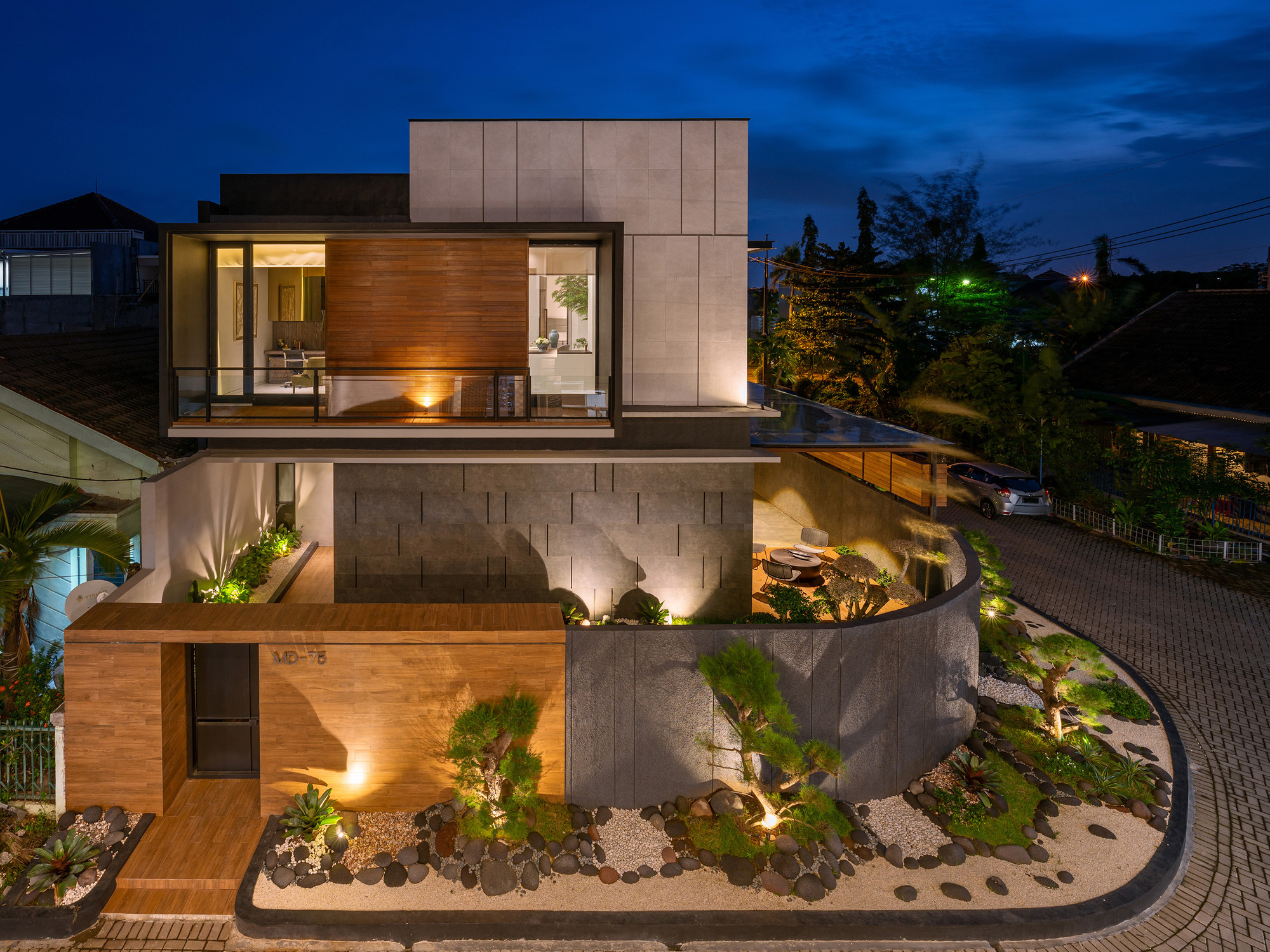
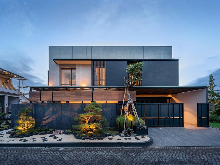
J House in Indonesia. Photo by Antonius Widjaya.

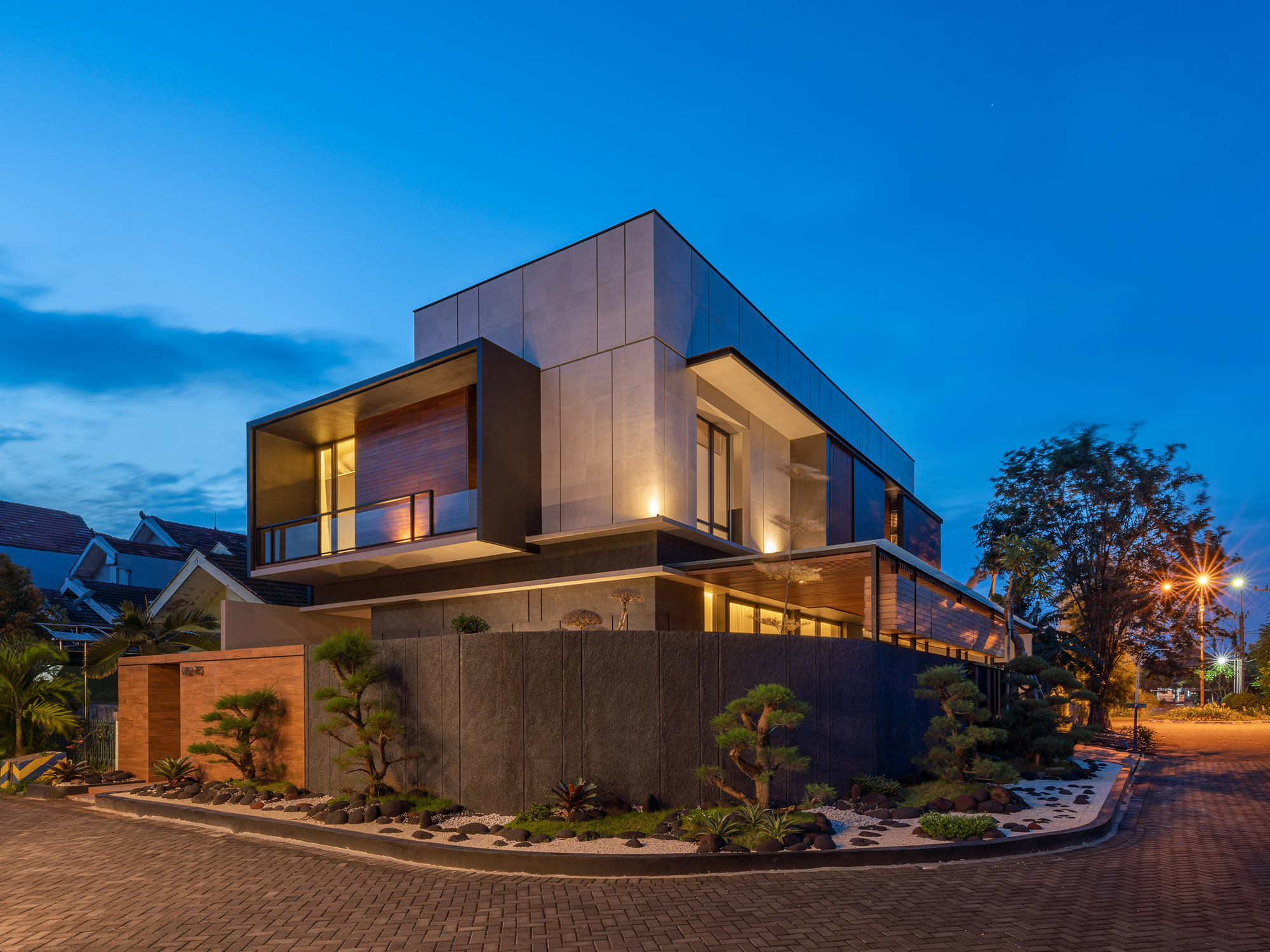
House with obvious Japanese aesthetic influence on the island of Java, by y0 Design Architect.

The main feature of the site chosen for the design —direct sunlight from the west side, which causes difficulties at an average temperature of 22-29°C.

.

The simple geometric shape of the house was chosen, but with an abundance of detail. The concrete —is the main building material used for both the foundation and walls. Wood, tile and steel are used in finishing. To reduce heat on the west side, the walls are filled with spaces or architectural details. Many openings are also used for maximum ventilation and natural light.

J House in Indonesia. Photo by Antonius Widjaya.
Nicole Climanova

Gray, dull, massive. These are the first associations when we hear the word concrete. However, adding pigment to the traditional mixture of cement, sand, gravel and water allows concrete to be colored in mass. And this allows you to highlight the volumes of the building, fit into the context of the surroundings and realize bold ideas, obtaining a more durable and reliable result than painting.

Yellow and  red colors add iron oxide to concrete, cobalt oxide to blue and chrome oxide to &mdash green. A deep black color is obtained by using black iron oxide, carbon oxide and pozzolanic cement.

Here are a few projects using colored concrete.

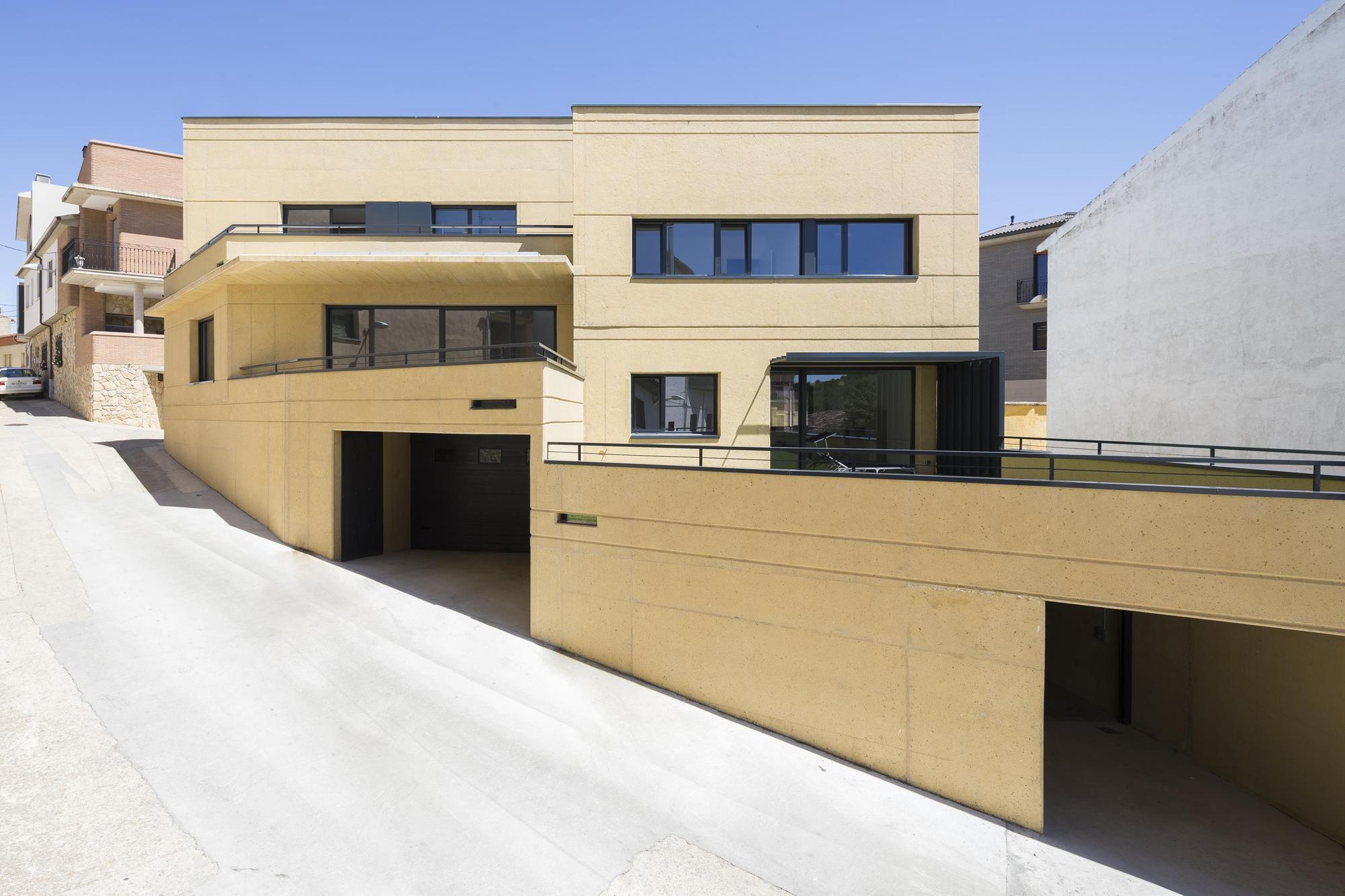
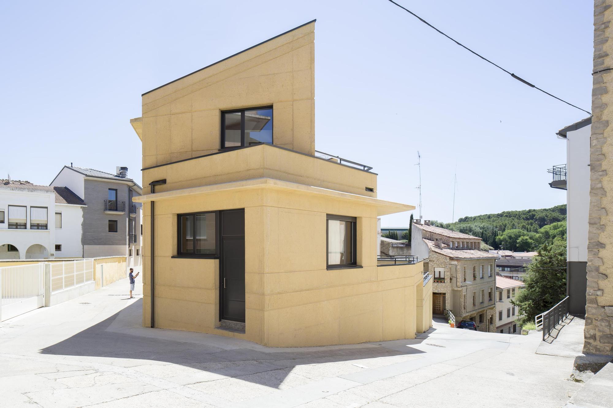
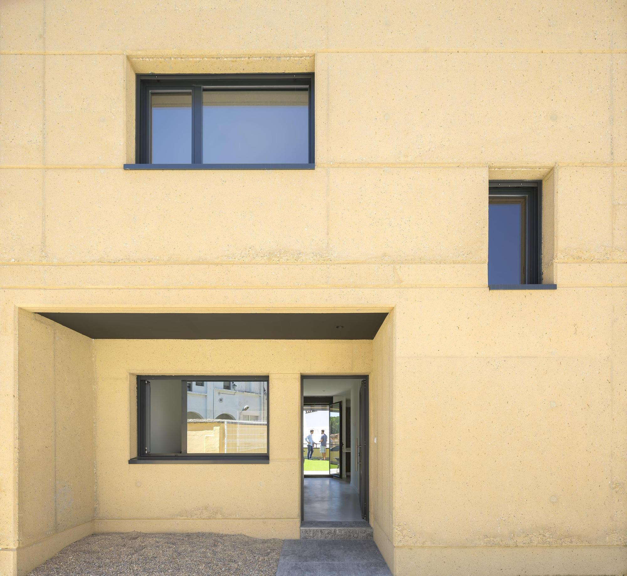
1. A house in Lerina, Spain. Architects azpilicueta arquitectura y paisaje.

The yellow color of the concrete references the traditional wall of adobe, while the material itself is durable, easy to produce and maintain.

Home in Lerina, Spain.

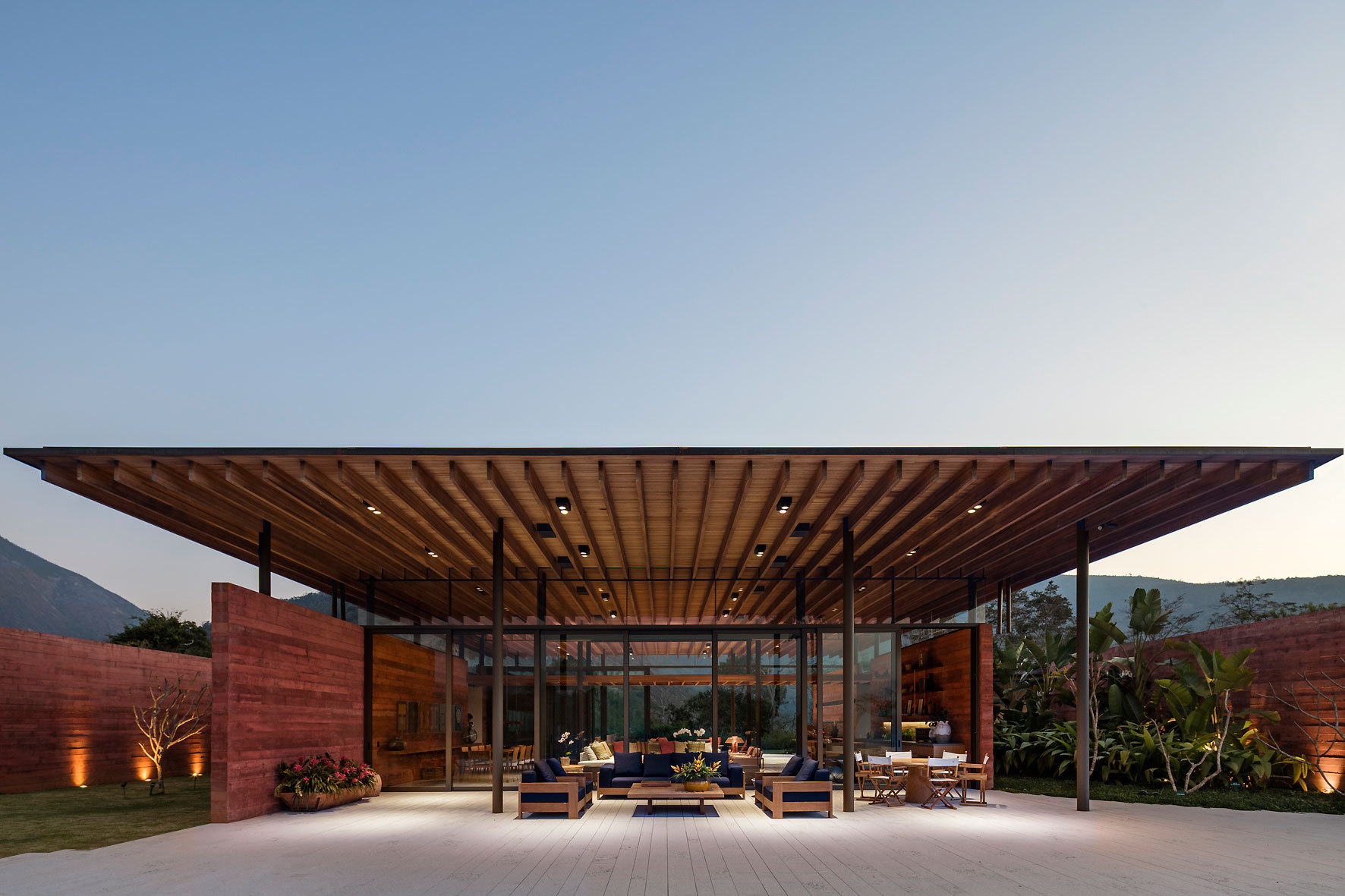
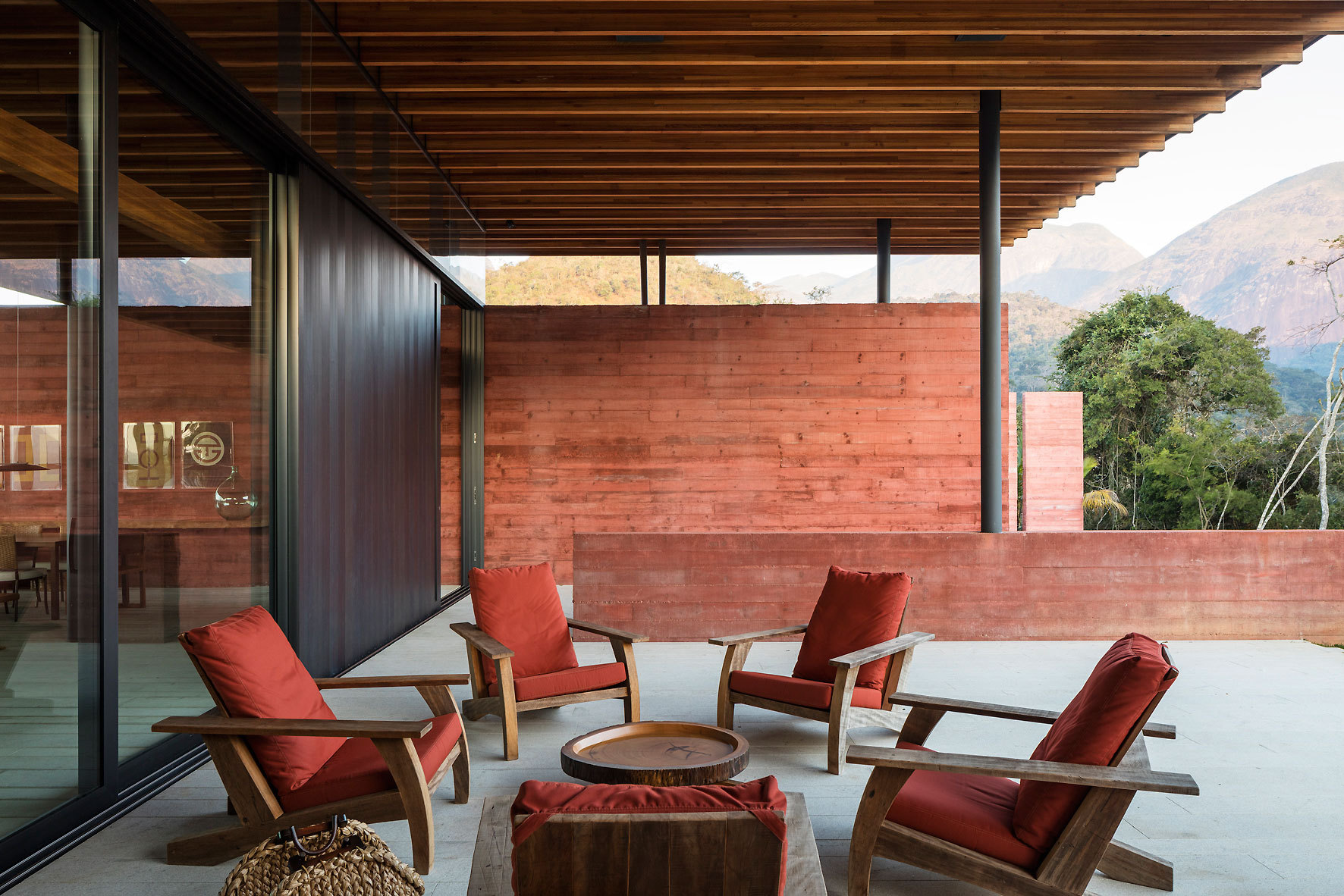
2. Casa Terra, Brazil. Architects Bernardes Arquitetura.

The walls of pigmented concrete are perpendicular to the main axis of the house, and as slices the space into courtyards. The tinting in red is non-uniform, which enlivens the interior.

Casa Terra, Brazil.
Casa Terra, Brazil.

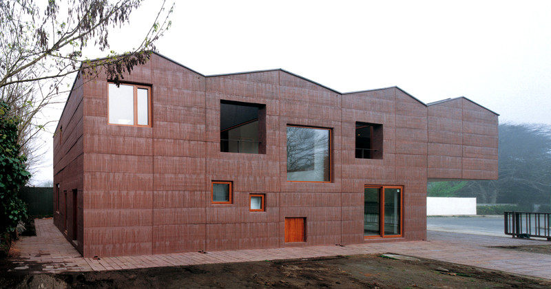
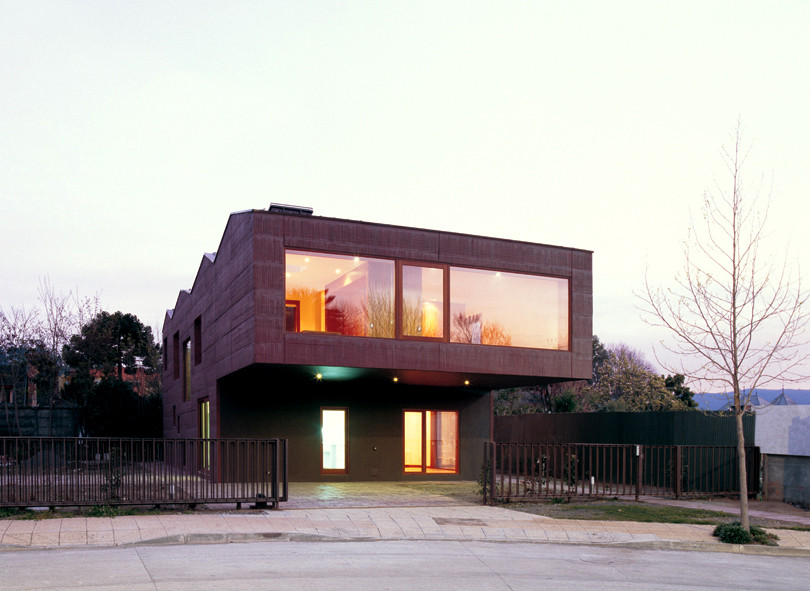
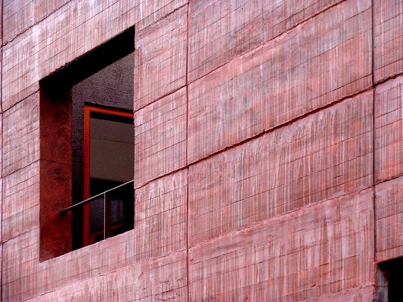
3. Pael House, Chile. Architects Pezo von Ellrichshausen.

The only way not to age is to be born old. The concrete blocks are made in layers over each other, which gives a flowing effect on the façade.

Pael House, Chile.
Pael House, Chile.
Pael House, Chile.

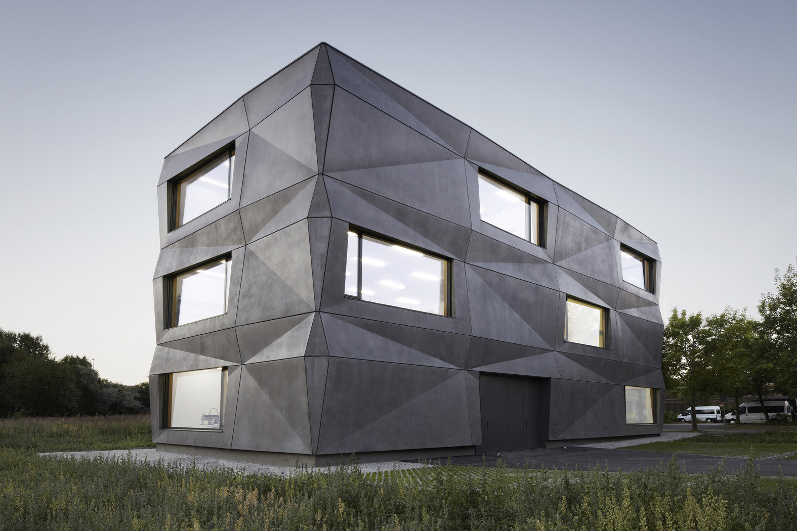
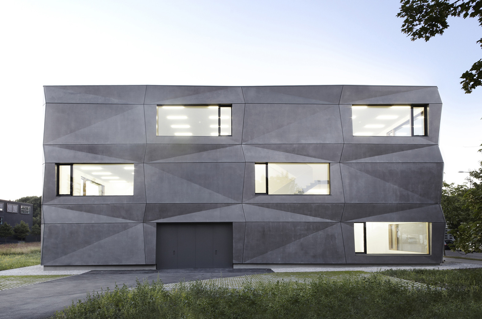
4. Textilmacher, Germany. Tillich Architektur architects.

The complex geometry of the facade combined with the anthracite concrete generates a play of light and shade. Depending on the weather and brightness, the color and character of the facade changes.

Textilmacher, Germany.
Practical issues of "The Secrets of Beautiful Facades"