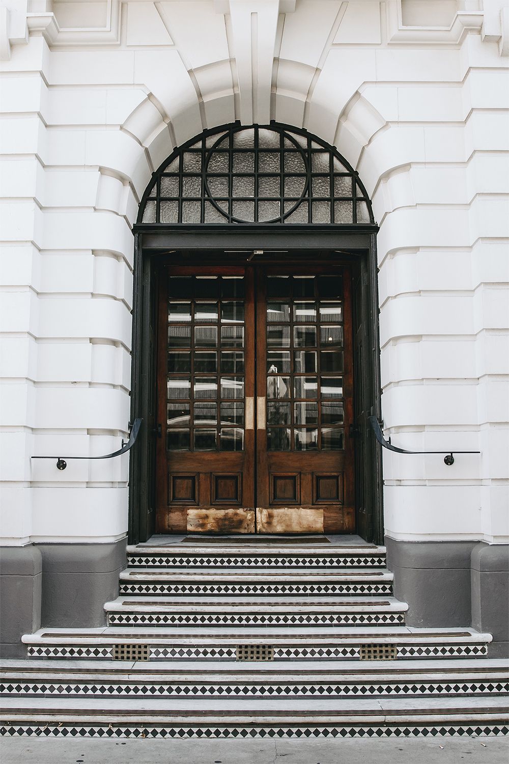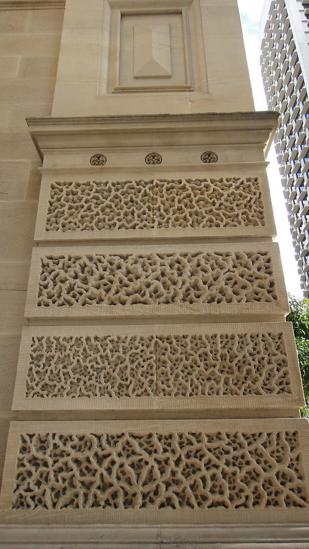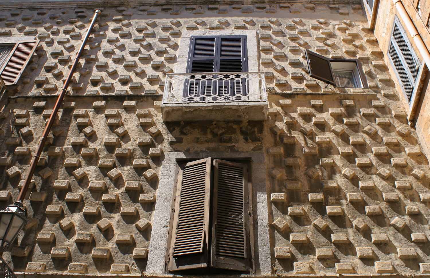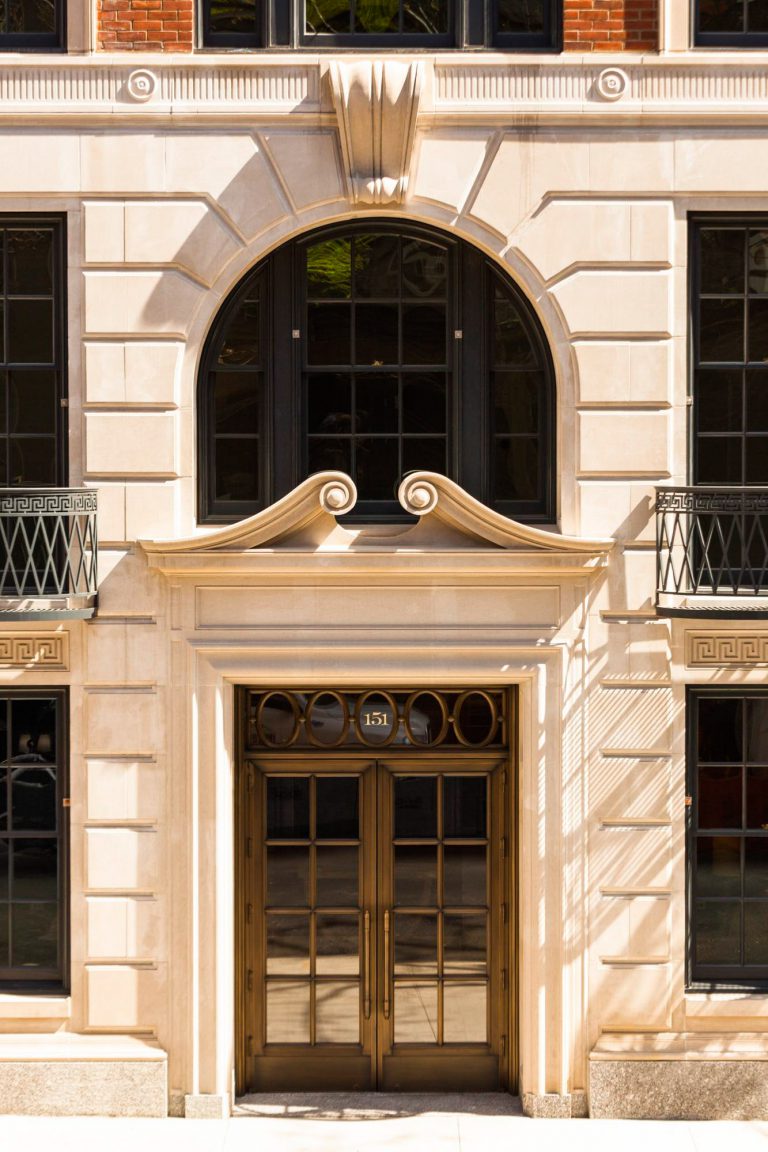
Hello, this is Maria, and today I want to talk about rustication, an architectural technique that I consider to be one of the most underrated in modern construction. I have used rustication in more than 30 projects over the past 12 years, and each time it has opened up for me in a new way.
What rustic is and why it fascinates me
Let me start with a personal confession: when I first started working, rustic seemed boring and old-fashioned. I mean, what do you think, a relief masonry with deep joints! But the more I worked with this technique, the more I fell in love with its possibilities.
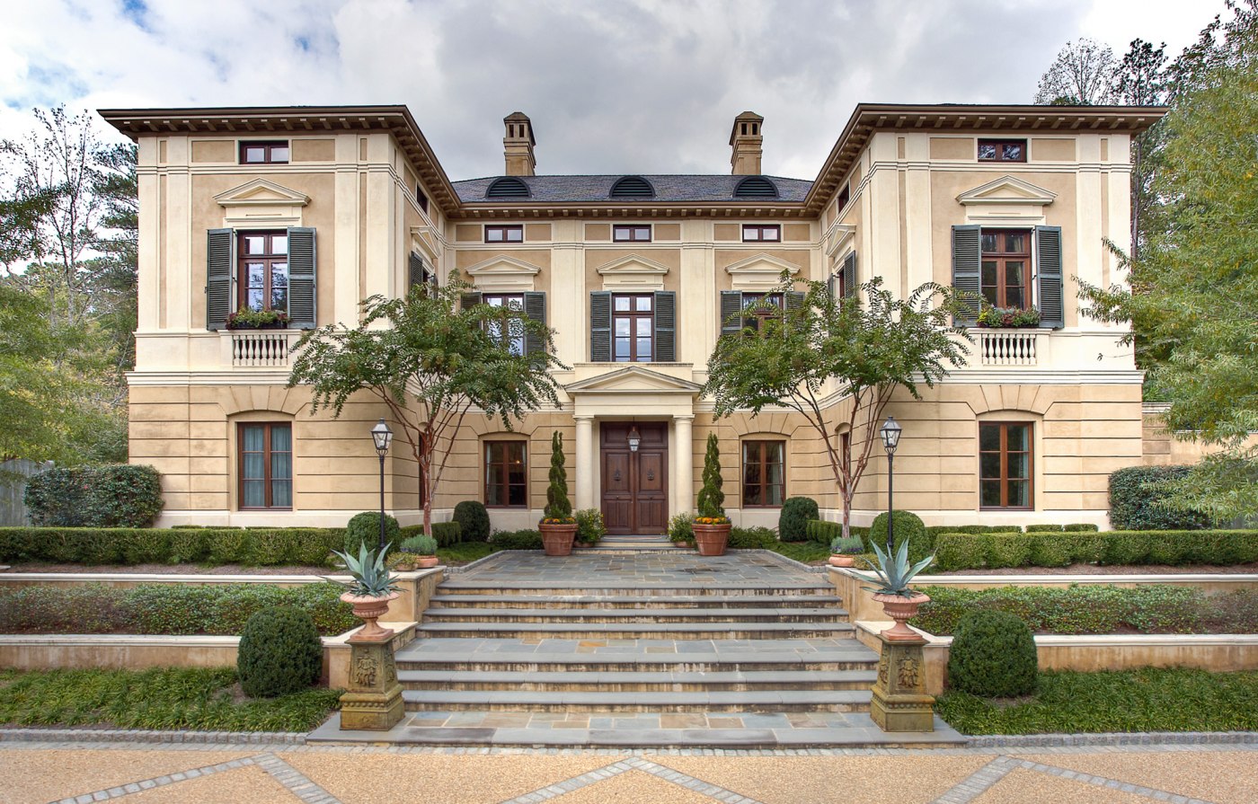
The rustic — is not just a decorative treatment of stone. It is a whole architectural language that can tell you more about a building than any other element of the facade. The depth of the joint, the texture of the stone, the rhythm of the masonry - all this creates a unique character of the building.
To dive deeper into the topic, read our article on rustication.
My favorite historical examples
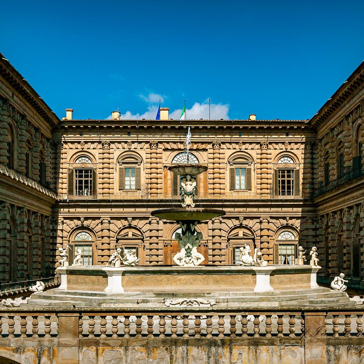
Palazzo Pitti in Florence — is a personal favorite of mine. I remember the first time I saw it in person - those huge rough-hewn stone blocks are literally hypnotizing! The lower floor is made as brutal as possible, while the upper floors are more restrained. This technique creates an amazing sense of reliability and strength.
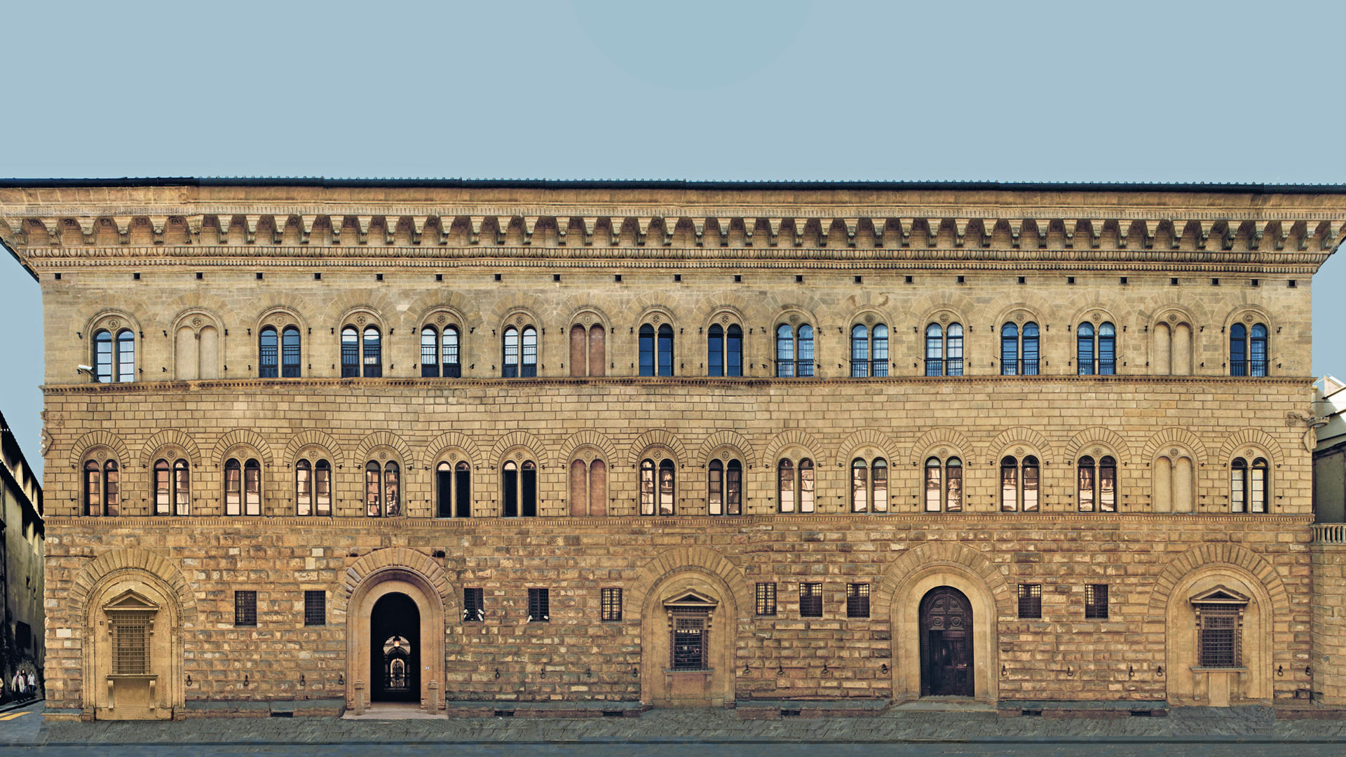
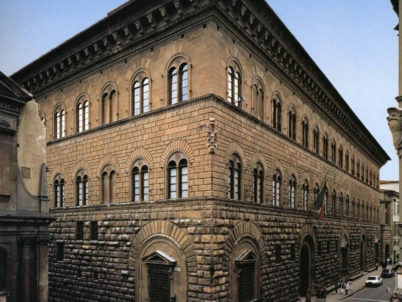
Palazzo Medici Riccardi shows how different types of rustication can be used on the same facade. The first floor is brutal diamond rust, the second floor is more relaxed, and the third floor is almost smooth. It's like a symphony where each floor plays its part!
My favorite modern examples are
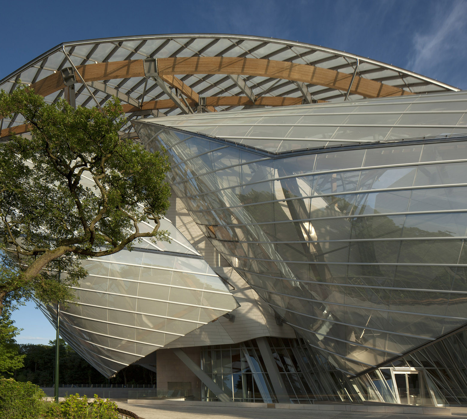
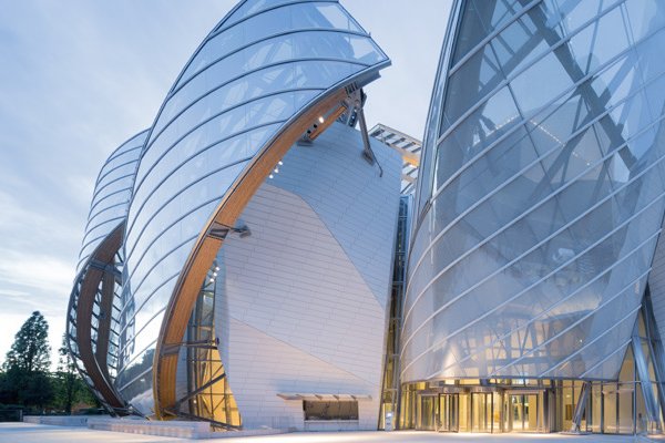
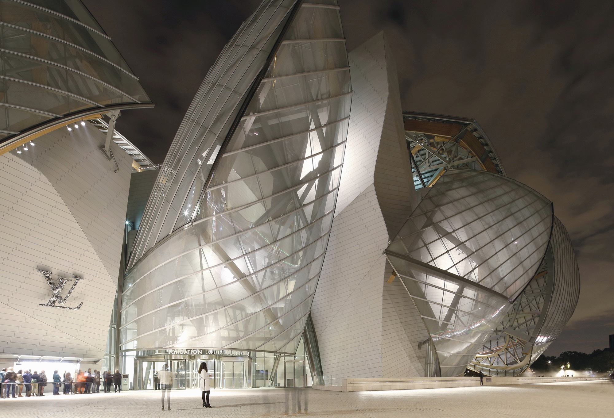
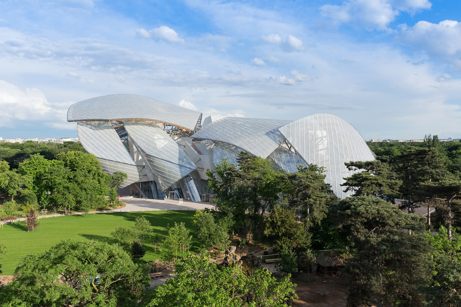
The new headquarters of the Louis Vuitton Foundation in Paris: here, rustication is used in the glass panels! A stunning example of how a classic technique can be reinterpreted in modern materials.
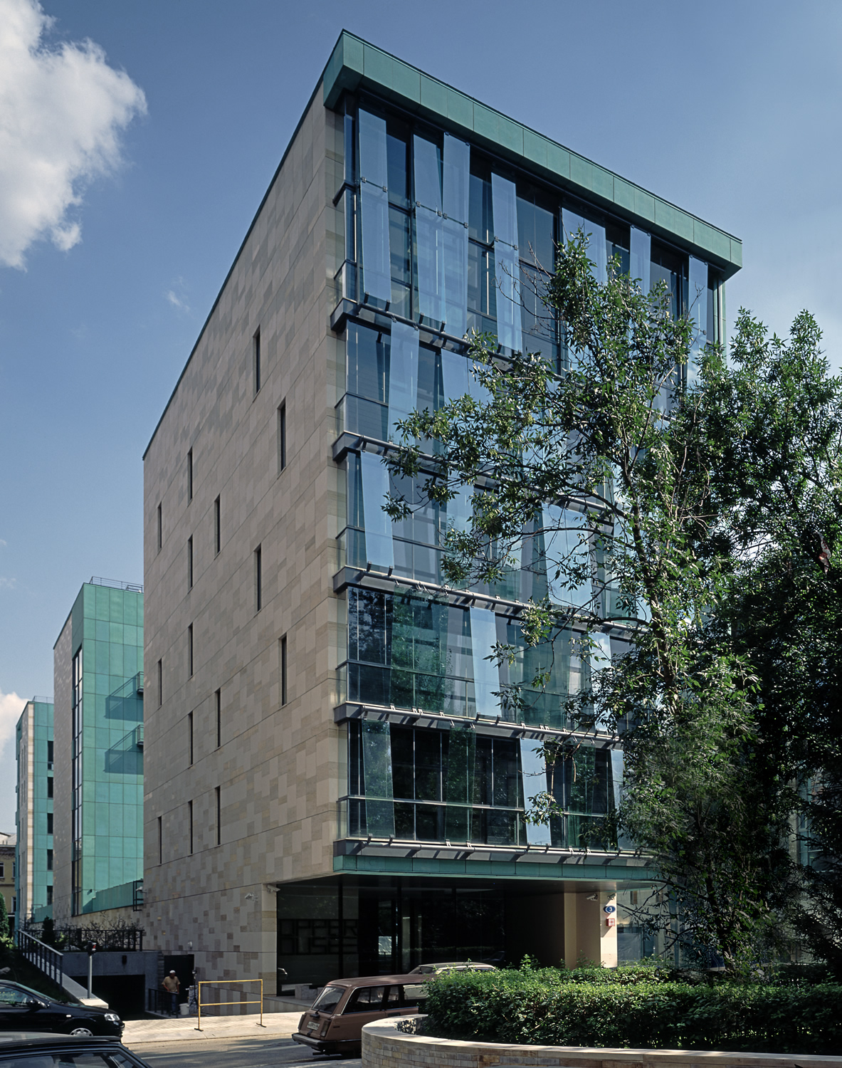
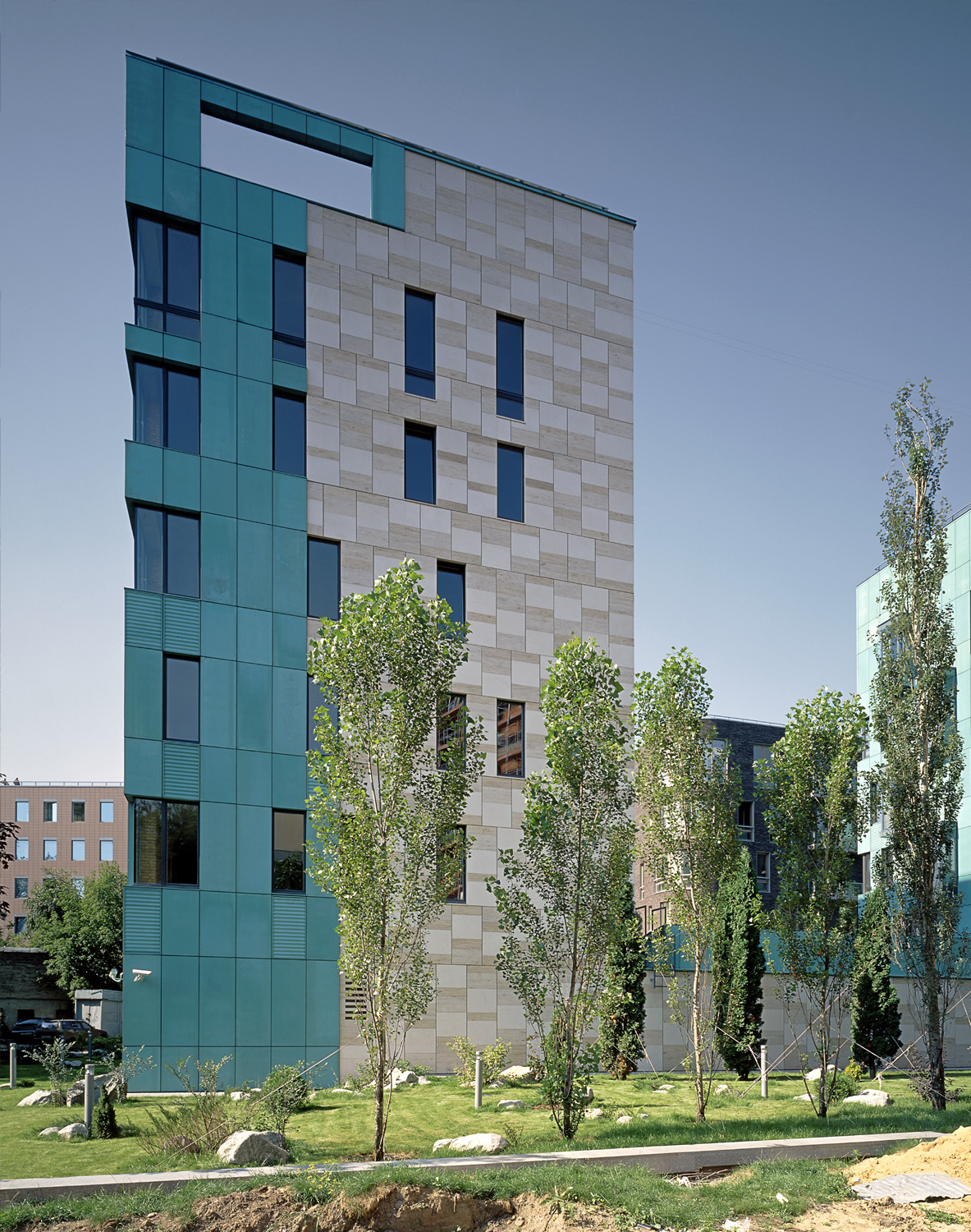
Cooper House on Butikovsky Lane by Sergei Skuratov: a real master class in modern interpretation of rustication. The facade is finished with a complex masonry of clinker bricks, where the alternation of horizontal and vertical elements creates an expressive relief. Particularly impressive is the way in which the architect has played with the corner of the building, using rusticated masonry to create a plastic transition.
Practical tips from me
Over the years I have developed a few rules for using rustication:
- Proportion matters
- For private houses, I recommend blocks no larger than 40-50 cm in heightу
- The depth of the joint should be proportional to the size of the block (usually 2-4 cm for medium-sized blocks)
Materials and textures
- Natural stone: the most expensive but also the most spectacular option
- Concrete: an excellent alternative for modern projects
- Plaster: a budget option, but requires skill in execution
Where to use
- Basement and ground floor: a classic that always works
- Accent walls: create a focal point
- Separate elements: portals, window frames
Common mistakes
- Overdoing the rustication. Some people cover the entire facade with rust, from the foundation to the roof. It's like wearing an evening dress to the beach - too much!
- Inconsistency of style. I recently saw a minimalist house with massive rustication in a classic style. It's like wearing sneakers under a tuxedo.
- Wrong proportions. A shallow rust on a large building or vice versa is like the wrong clothing size.
The rustication is not just a decorative technique, it is a powerful tool in the hands of the architect. It can make a building monumental or light, traditional or modern. The main thing is not to be afraid to experiment!
