Neoclassicism
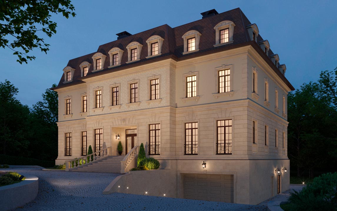
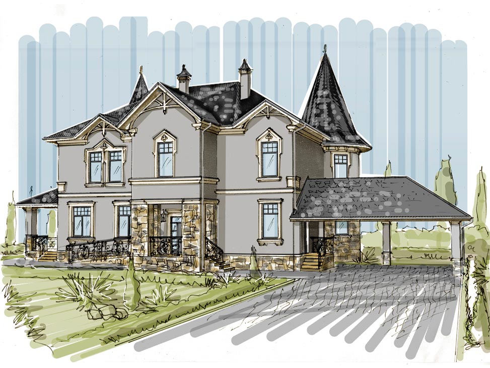
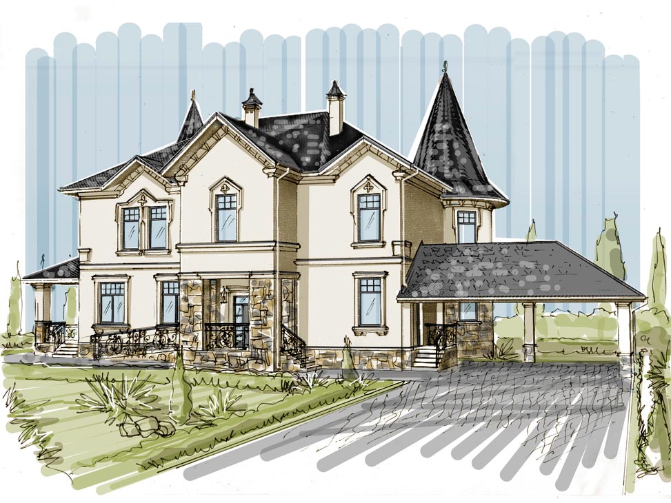
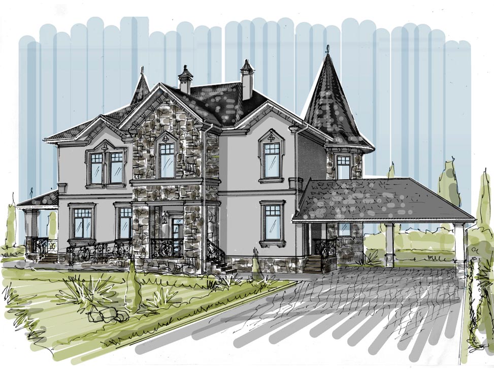
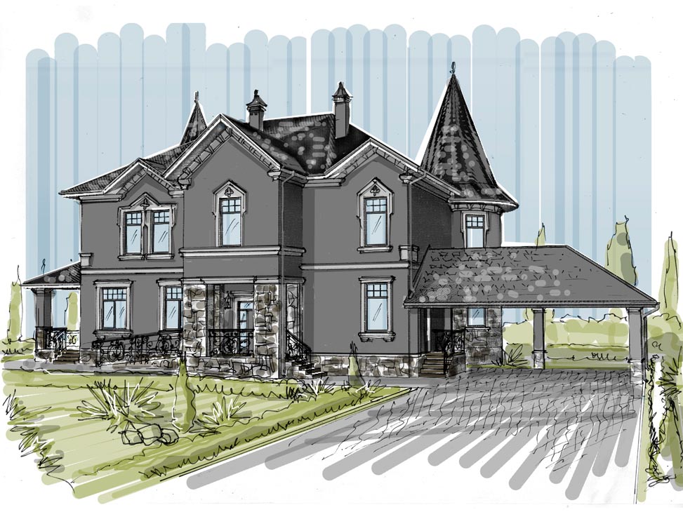
The classic look of a house never goes out of style, no matter how hard modern flat-roofed houses try to take the lead. Today I'll break down a recent French château-inspired project I worked on and talk about the techniques I used while designing the facade.
The first thing to look for is symmetry, one of the defining traits of the classical tradition. The bold central projection, with the wide main staircase framed by balusters, immediately sets a stately tone.
The decoration is lavish, yet it never jars the eye, because it stays within a single pastel palette and the transitions between elements are kept as smooth as possible.
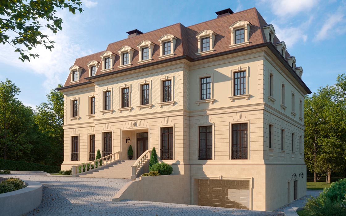
By decoration I don't just mean window frames or pilasters. The ground floor is fully rusticated, and above the openings there are rusticated arches and three-dimensional elements like keystones.
At the corners of the second floor are corner quoins that echo the ground-floor rustication.
Higher up, I added framing to the dormer windows with semicircular tympanums to balance out the many corners, along with graceful brackets on the pilasters.
But since everything is essentially the same color, you need different materials to keep the facade from looking dull.
The ground floor, which is more visible and interacts with people the most, is faced with the more expensive natural stone; the second floor is set off by a string course and plastered, and the projection above the entrance portal is tiled.