
, .
Light or Dark?
The choice of tones for a facade comes down to the client's personal taste. Either direction can look equally interesting and stylish.
In this project, for example, the range of tones is fairly wide, yet all four options look bright, polished, and entirely fitting.
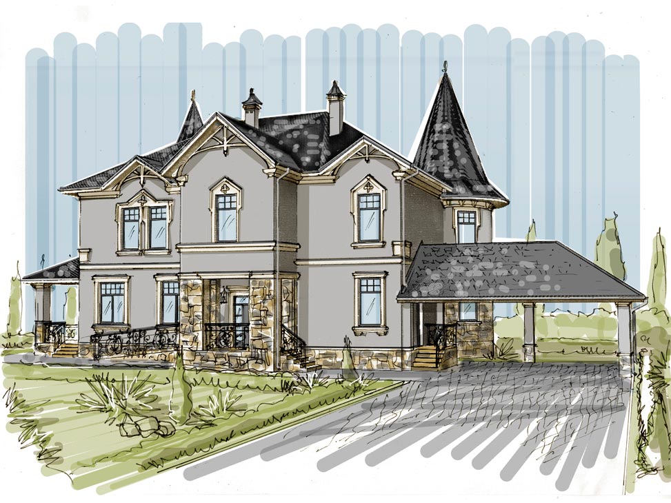
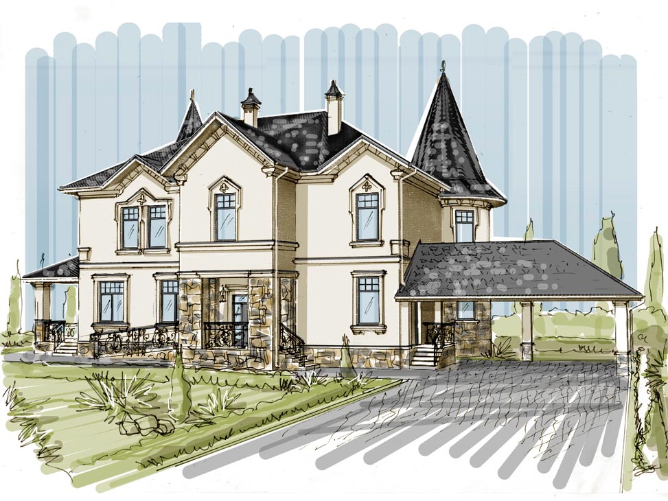
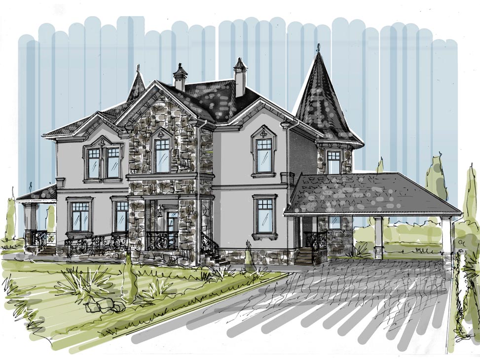
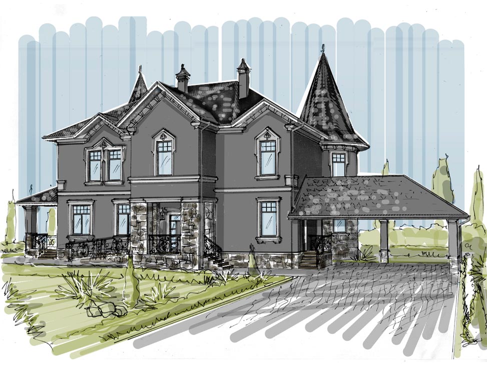
Keep in mind, though, that a darker color heats up more in the sun, so the temperature inside will rise more in hot weather, too.
Saturated colors are also more prone to fading.
One more important detail about shades: even if you're absolutely delighted with the chosen color in the project, sketch, or rendering, in reality it will turn out a little different—so it's worth doing test swatches of the actual paint.