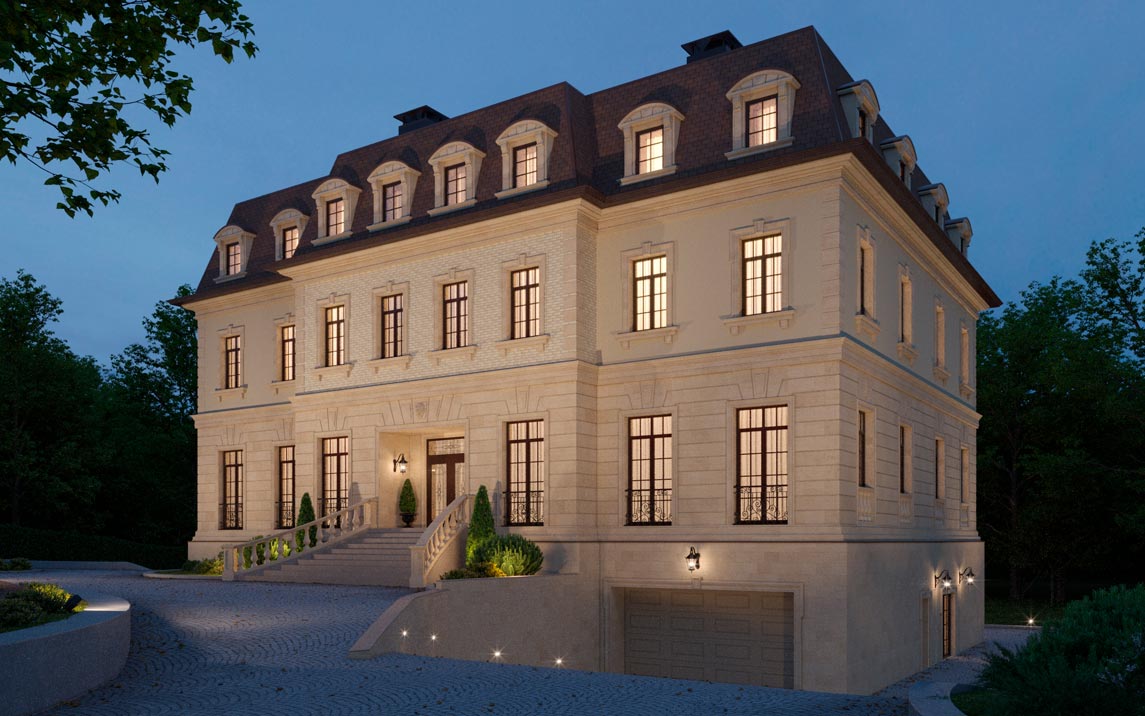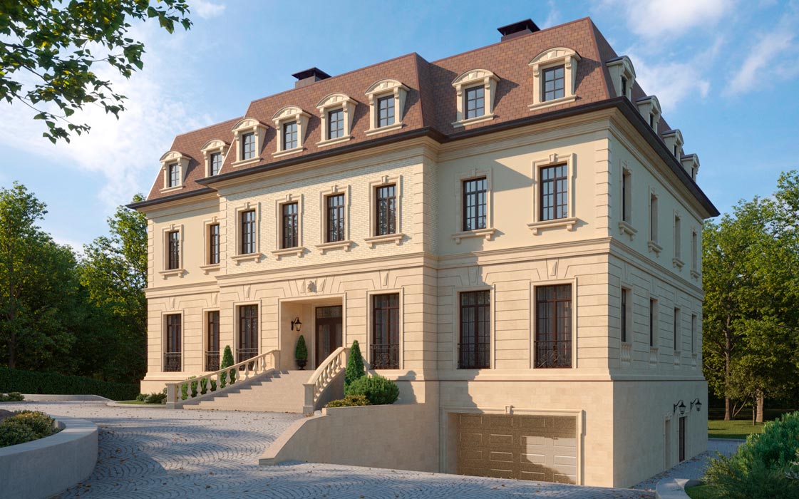
Neoclassicism

The classic look of the house is relevant at all times, no matter how modern houses with flat roofs try to take the lead. Today I will take apart a recent French château-inspired project I worked on and talk about the techniques I used during the design of the façade.
The first thing to look for is symmetry, one of the main characteristics of a classical heritage. The expressive central risalite with a wide staircase of the main entrance, framed with balusters, immediately sets a solemn tone.
The decor is simultaneously plentiful, but it does not sting the eye, thanks to the fact that it is in a single pastel palette, the contrast of the transition is smoothed as much as possible.

By decor I mean not only window frames or pilasters. The first floor is completely rusticated, and above the openings there are arcs of rustication and volumetric elements, like keystones.
At the corners of the second floor are corner bosses, in support of the first floor rustication.
Going up, I added framing to the dormer windows with semi-circular tympanas, balancing the large number of corners, and graceful brackets on the pilasters.
But since everything is basically the same color, you need different materials to make the façade not look boring.
The ground floor, which is more visible and interacts more with people, is more expensive with natural stone; the second floor is separated by a belt and plastered, and the risalita above the entrance portal is tiled.