ArchReview #143
2
3
4
5
6
7
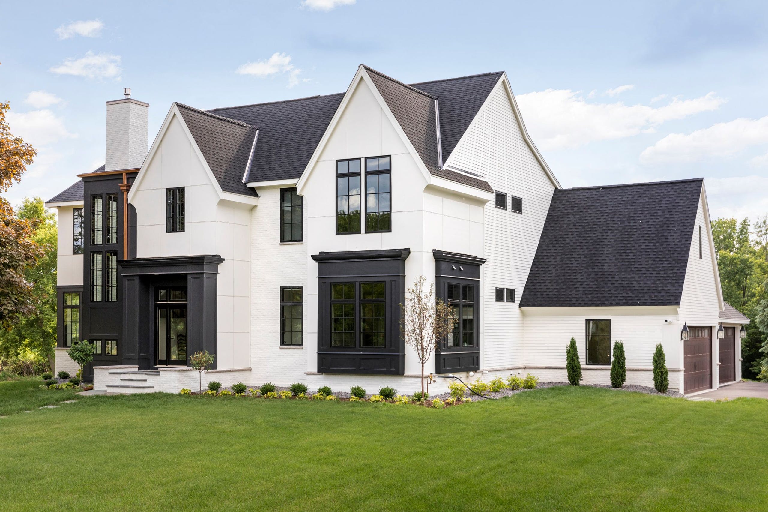
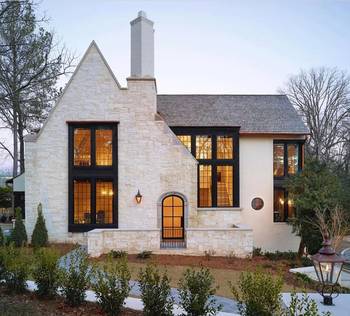
This house is especially relevant today. Because it combines classic and modern. And the classic comes from the Tudor style, not from Italian architecture.
Many people are not ready to build a house with a flat roof. And here the form is classic, but it's simplified and the finishes are very concise.
You can see on this house that you don't have to imitate the medieval style, the stones, the decor. This house is internally comfortable if you like the classics, but it is a modern current house. .
2
The shapes are slender. The gables are eye-catching, give a broken roof line, no annoying symmetry. Beautiful!3
Accents are important. Here it is the shiny copper gutters on a black background.4
It's probably fiber cement panels or HPL panels.5
On the side facade, even cheap siding has not been spared - rational optimization.6
The dark gray inserts tie in nicely with the high roof. The facade is graphic in both shape and contrast.7
The most important part of the image is the radius curls on the gable. This house has everything: contrast, accents, nuance.More examples of such houses in the post "More Gothic."
Facade #10619 from Archi.Capital base.

