ArchReview #135
1
2
3
4
5

Review :
1
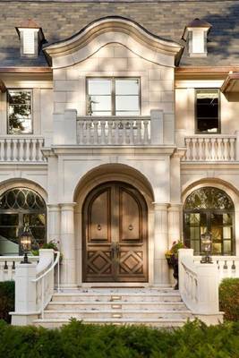
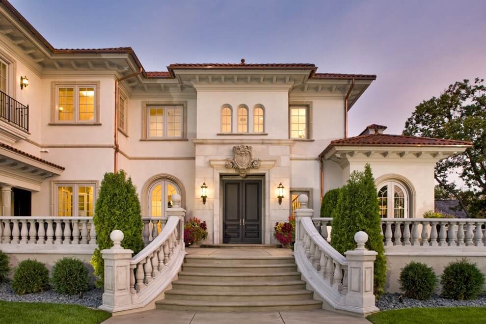
A front entrance is meant to be grand, so it has double doors. Each leaf, on its own, is too narrow to pass through, so doors like these should always stay open. That's fine for a symmetrical classical facade, but daring to install them takes either a butler or a love of art-they aren't convenient to use. The three-part model is everywhere: a wide leaf in the center and two narrow fixed strips on the sides.2
Windows can be left plain. Here the decor is omitted to contrast with the ornate entrance.3
The seams between the short elements stand out clearly on the interstory cornice. Short pieces are a mark of expensive, "quality" decor-an imitation of a historical moment, the way stonemasons once hewed stones to build up a facade.4
The whole house is finished in stucco, with the entrance in stone of the same tone. It's a perfect illustration of a principle we recommend and apply: expensive accents belong where they're seen and where people come into contact with them.5
A good balustrade should have a solid base, as it does here. This part is very often left out or underwhelming. Without a good base, you end up with disproportionately thin, long balusters.Facade #10397 from Archi.Capital base.