ArchReview #102
2
3
4
5
6
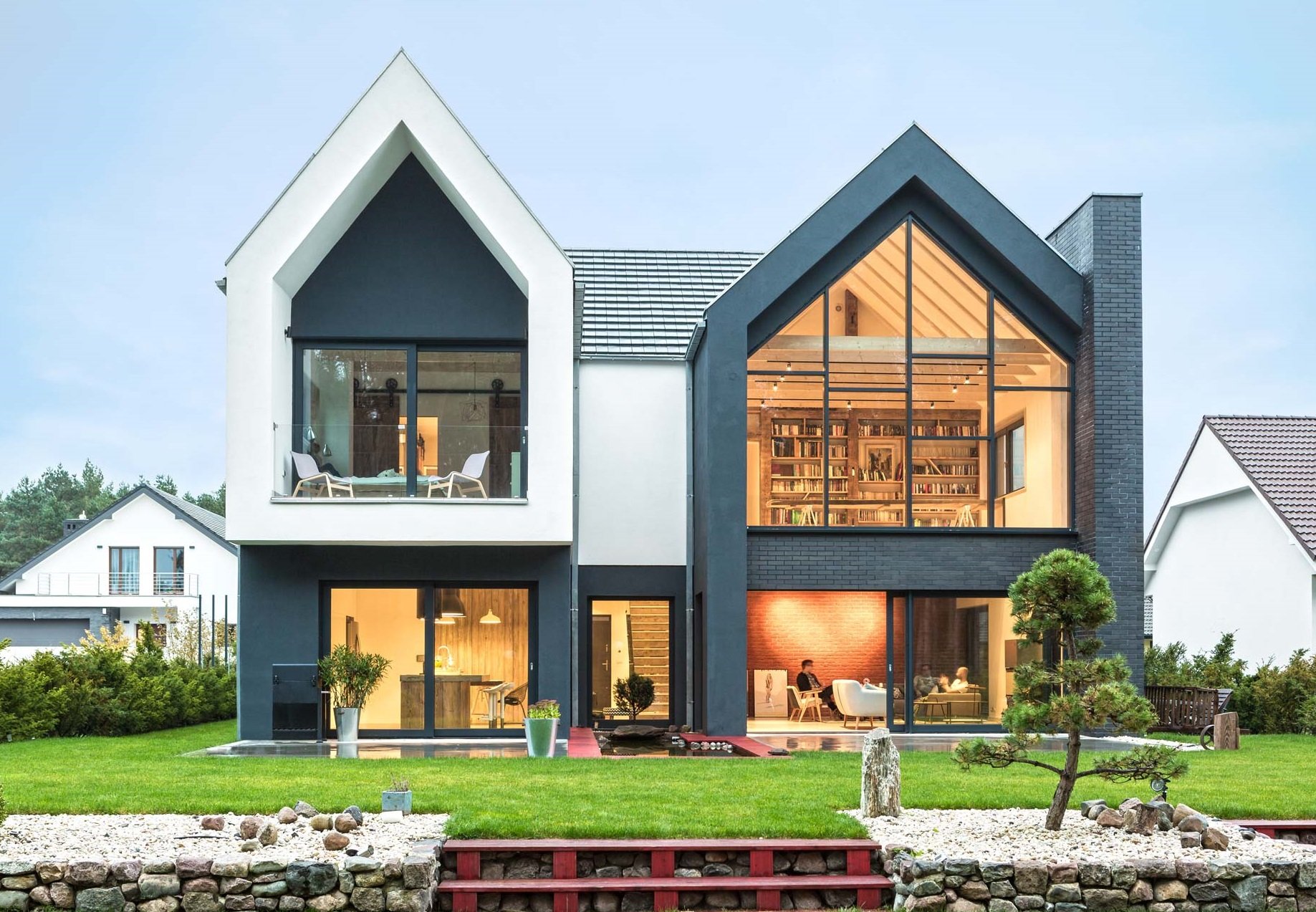
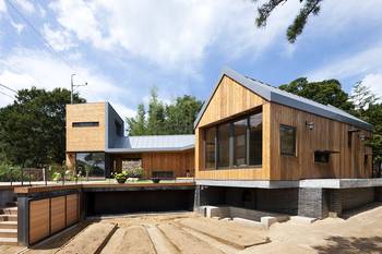
It's such a twin barnhouse. Chekhov's The Thick and the Thin.
2
Contrasting color scheme - anthracite and white.3
The house is not for everyone, assumes maximum openness.4
The house blends in well with the area.5
All elements work for a graphic image. Even the roof forms super-contrasting stripes.6
Interesting, "sloppy" arrangement of frames. The thinness of the frames is impressive - an indicator of high quality glazing.Facade #9513 from Archi.Capital base.

