ArchReview #134
2
3
4
5
6
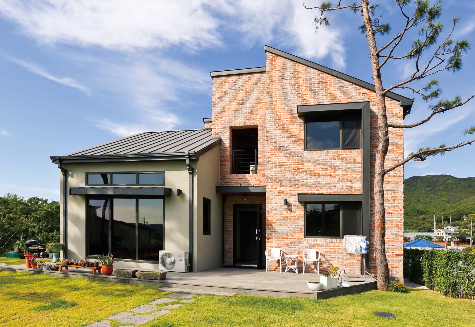
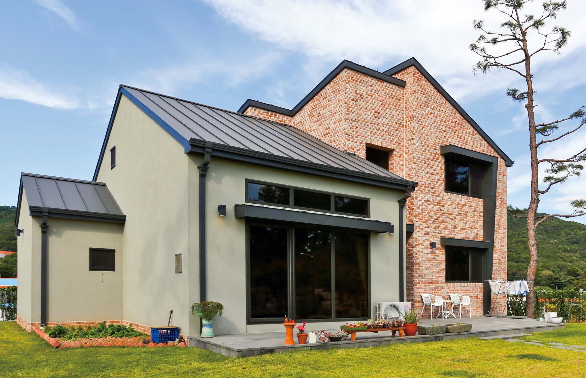
The house is expressively divided into two parts: by the volume and the type of finish. The left part is monochrome and grounded. The right side is bright, angular and tall.
2
The seam roof looks perfect and forms a unit with the gutter. Gutter with a square cross section fits well in modern homes.3
The voluminous "eyebrow" between the two windows is clearly visible in the picture below. Very good find - and the facade organically decorates and protects from unnecessary southern sun. 4
The color of the terrace boards is earthy, very organic, does not draw attention to itself.5
Not a great location of the air conditioner. 6
Light grout. The designer overcame the temptation to make the grout dark to contrast with the light brick. In return, he got a natural mottled texture. Not as fractional and geometric as the usual brickwork.