ArchReview #133
2
3
4
5
6
7
8
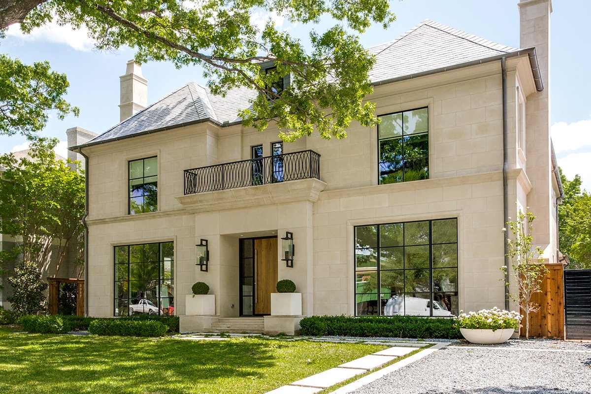
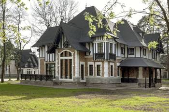
It's one of the most interesting houses I've seen in a long time. It wonderfully combines classic and modern. The architecture is symmetrical with two risalites and a projecting entrance portico. This makes not only the walls but also the roof beautiful. The most important thing is the feeling of the house. You don't have to fight the conflicting desire to be surrounded by classics and yet live in a modern home.
Translated with www.DeepL.com/Translator (free version)
2
Large windows, as tall as a man, with thin, black frames.3
The lanterns are expertly made. Large and expressive enough to occupy the assigned role of front facade decoration.4
The gray roof, a cool shade dissolves in the sky and emphasizes the warmth of the facade.5
The drainpipes are let down on the main facade, not against common sense, but to frame the image with a dark frame.6
Roman blinds form not only the comfort inside, but also the image of the facade.7
A modern door.8
The decor of the house is non-contrasting. The role of expressive "eyelashes" in the openings is played by dark frames. The windows, fences, and lanterns are super-contrasted but subtle in silhouette. The house as a whole remains in a light key with a beautiful finish of smooth limestone slabs.Facade #10028 from Archi.Capital base.

