ArchReview #129
2
3
4
5
6
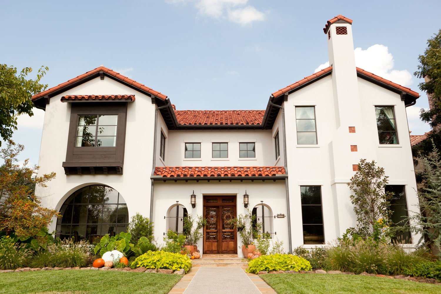
A beautiful blend of German and Greek.
2
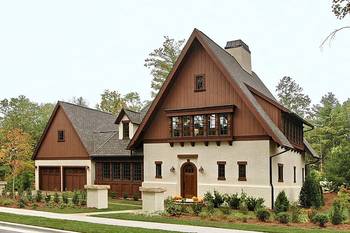
Against the white walls, the red shingles look like a holiday. We are pleased to see the alternation, the slopes and ends of the roof, it creates a dynamic.3
Orange grids.4
Dark lining of the roof, against which the ceramics look bright.5
The chimney is right on the main facade as a design element. 6
Additionally decorated with ceramic inserts. Space is left around the small tiles. There is a rhythm that turns the easy-to-make tiles into a pattern.Facade #10023 from Archi.Capital base.

