ArchReview #115
3
4
5

Review :
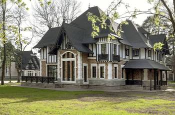
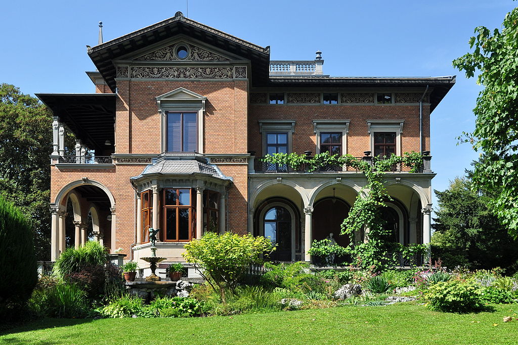
A good pairing of neo-Renaissance and brick walls. There's demand for a classic look in home design, but the combination with brick often comes out awkward. Let's look at this house's key choices.
First, note how well the house is scaled to modern needs. It's not a castle, but a large cottage.
3
The facade is laid out rhythmically, so we see repetition, but it never gets boring. For instance, we see two arcades, but from different angles,4
the triangle of the large gable, or the small triangle of the sandrik (window hood).5
The architecture is muscular. There are no plain flat walls; the planes alternate in depth and direction. The projecting risalit also carries an ornate bay window.But the main technique facade designers are reluctant to learn is keeping the trim very muted in tone. That takes real courage. Yet it brings harmony: the brick keeps its rich color, and the walls and stucco stop competing and start complementing each other.
Facade #6180 from Archi.Capital base.