ArchReview #137
1
2
3
4
5
6
1
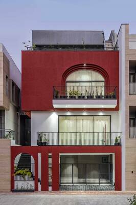
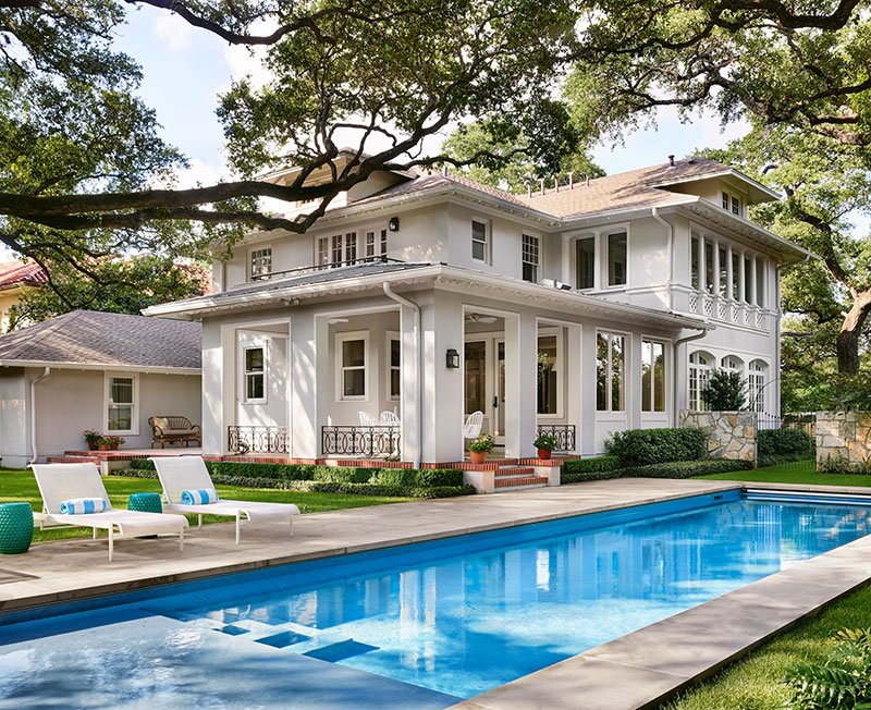
Wide columns build the terrace into the volume of the house, it does not look like a separate extension, as is often the case.2
The design of the openings with a white frame compensates for the simplicity of the wall supports.3
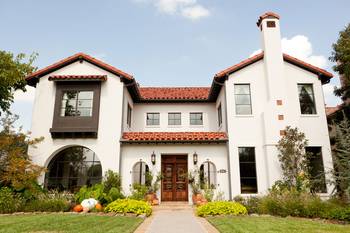
A series of small ornamental columns creates detail that makes the whole house look exquisite.4
The decors stand out only slightly against the beige, almost achromatic walls.5
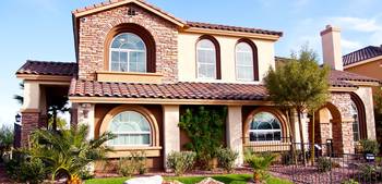
The oversized flagstone is expressive and rhymes well with wrought iron.6
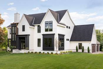
Forging of the right thickness. A common mistake designers make is forging that is too thin and lacks weight in the facade.Facade #10697 from Archi.Capital base.

