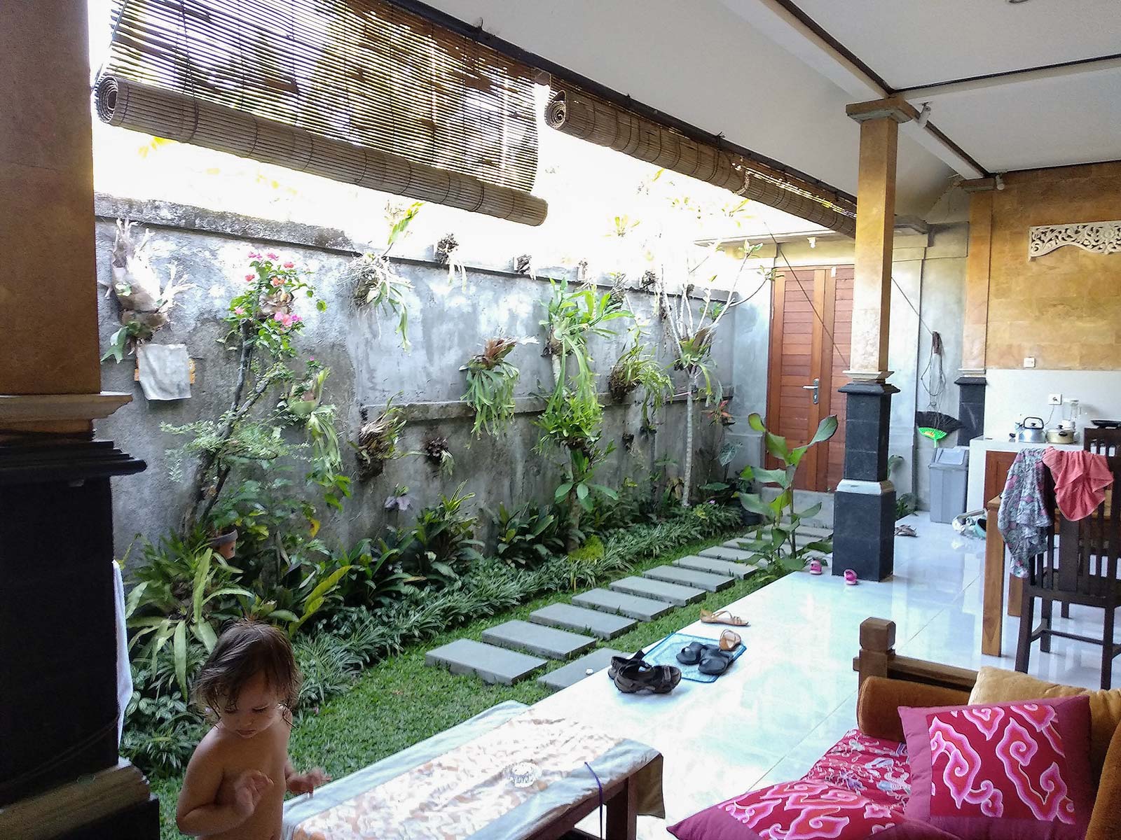
Terrace at home

It's interesting how my habits change when I get to a new place. Everyone can remember this from their travels. If you take the same family, the same things, the same kids, and consistently stay in different places, you can see how differently residents spend their days.

The places and things we use change our routine. Oddly enough, we adjust to the set of objects around us, furnish the space. The arrangement of the walls affects when we go to bed and wake up, how much we move, eat, read, entertain ourselves, talk to each other, and work.

The reciprocal location of the TV and the nursery? Which corners have good lighting during the day? Where is the house quiet? Is it convenient to carry food to the terrace? Is it hot or cool out there? Who can see me from the balcony? Who am I disturbing in the evening. Can I walk around these walls with interest? The shower, the bathroom, the pool, the size of the refrigerator, the canopy, the oven, the blender, the treadmill, the treadmill, the projector, the stereo, the streaming subscription. Each place has a different set and each time I change with that set.

I'm used to thinking about houses in the format of possibilities and usage scenarios.

Unfortunately, the time to create space is rarely given out -- when building and fixing up a house, when renovating, when choosing a rental property. And it's impossible to plan for everything at those times. You have to adjust and learn from experience.

The biggest mistake in building a house is to get a space inside as separate boxes with a window and a door, just like an apartment, only bigger. Life in these boxes is in itself dull, joyless, and not unlike a manufactured home in the city.

In these "containers" designers create niches of drywall, hang "beams" and multilevel ceilings, play with mirrors, and do everything to break up the confinement space. But decorating and furnishings don't completely solve the problem of boring, walled-off rectangular space.

The simple rectangle, the cube are the most artificial, man-made forms, and man wants a natural environment. Nature is blurry, complex, multifaceted, changeable, imperfect.

There is no need to strive for geometric logic, symmetry (unless you have an addiction). What looks beautiful on the plan will rub off on the soul. Suffice it to recall the Soviet districts built according to the geometric principle. I remember how dreary it was, despite the grandeur of the architects' designs. It's better when home architecture, not dominating, but dissolving.

Build a house, try to make the space interesting: connected volumes of rooms, lots of different windows, visual bridges, corners, turns, nooks, elevations and depressions (remembering about ergonomics), second light, breaks, visible roofs. Do not be afraid of oddities and irregularities - they will become native, they will be loved by children and grandchildren.

Practical issues of "The Secrets of Beautiful Facades"