The Pantone Institute named the color of the coming year. Usually the color was chosen from the existing palette, this year the employees created a new one.
The color of the year 2022 was named PANTONE 17-3938 Very Peri.
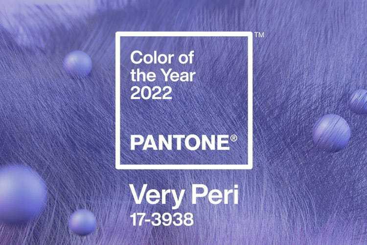
According to Laurie Pressman, vice president of the Pantone Color Institute, "the color of the year reflects what's happening in our global culture," so in a wave of coming out of isolation and at the same time pushing the boundaries of the virtual world, the experts created a new color that combines the "constancy" of blue with the "energy and excitement" of red.
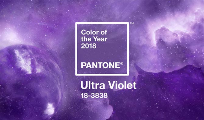
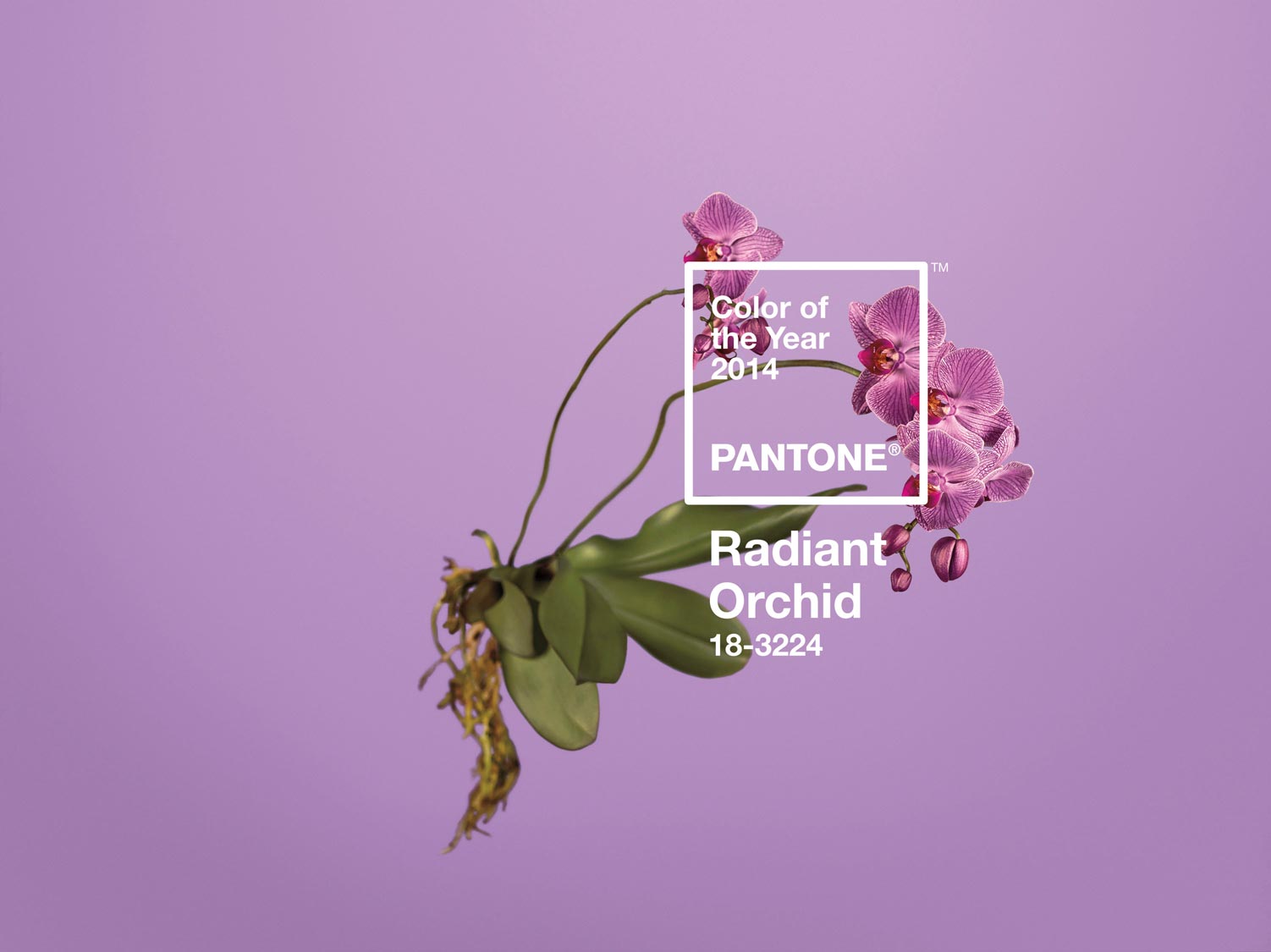
It is kind of new, but you can notice a certain cyclicity in the choice of tone, 4 years ago in 2018 the color of the year was Ultra Violet, and in 2014 - Radiant Orchid.
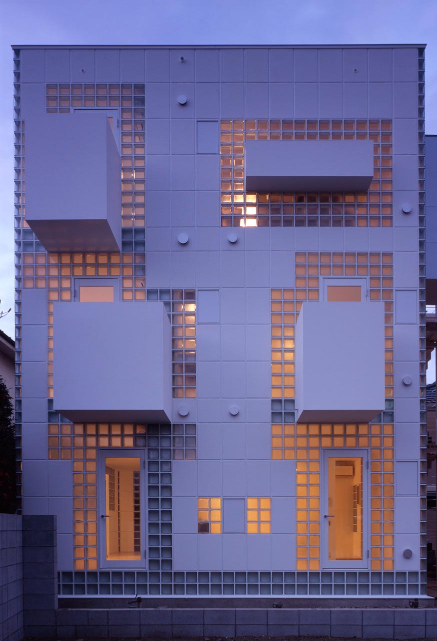
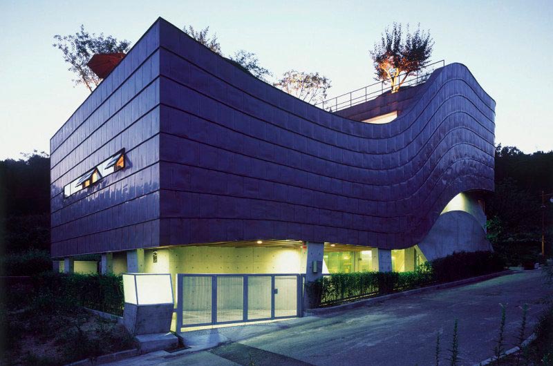
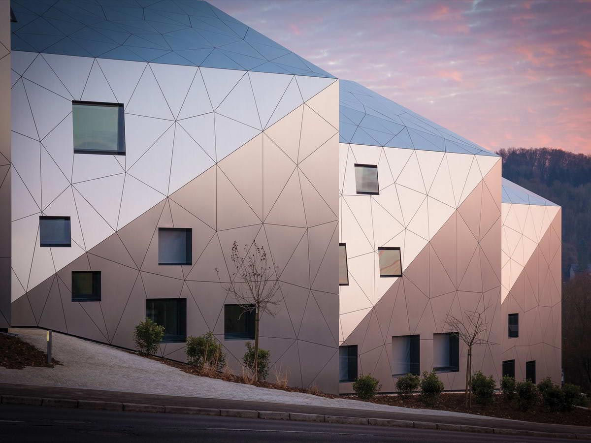
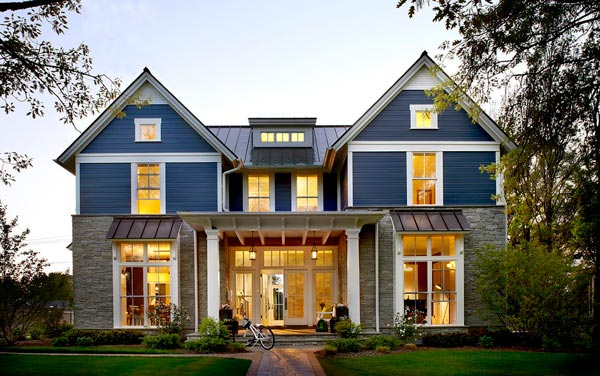
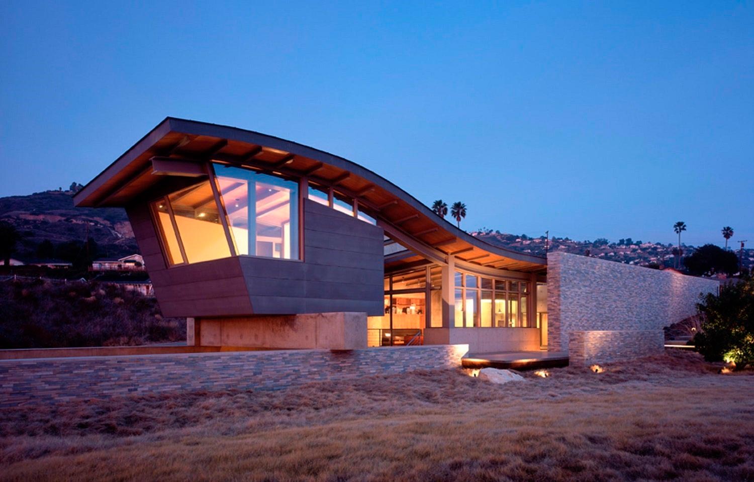
In architecture, this color is applicable to futuristic forms as a backlighting.

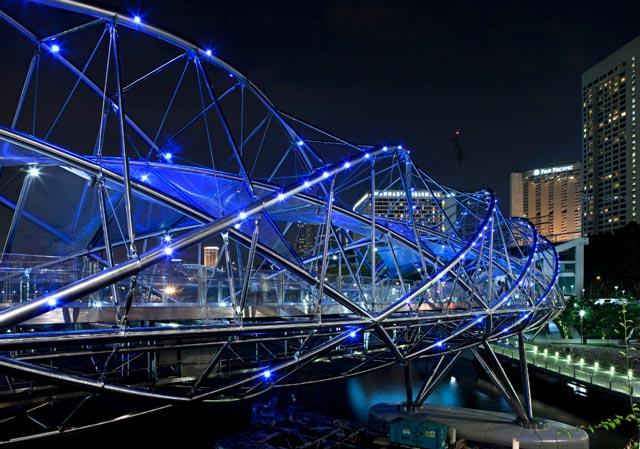
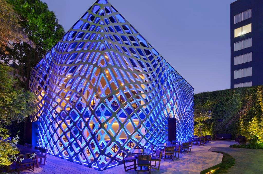
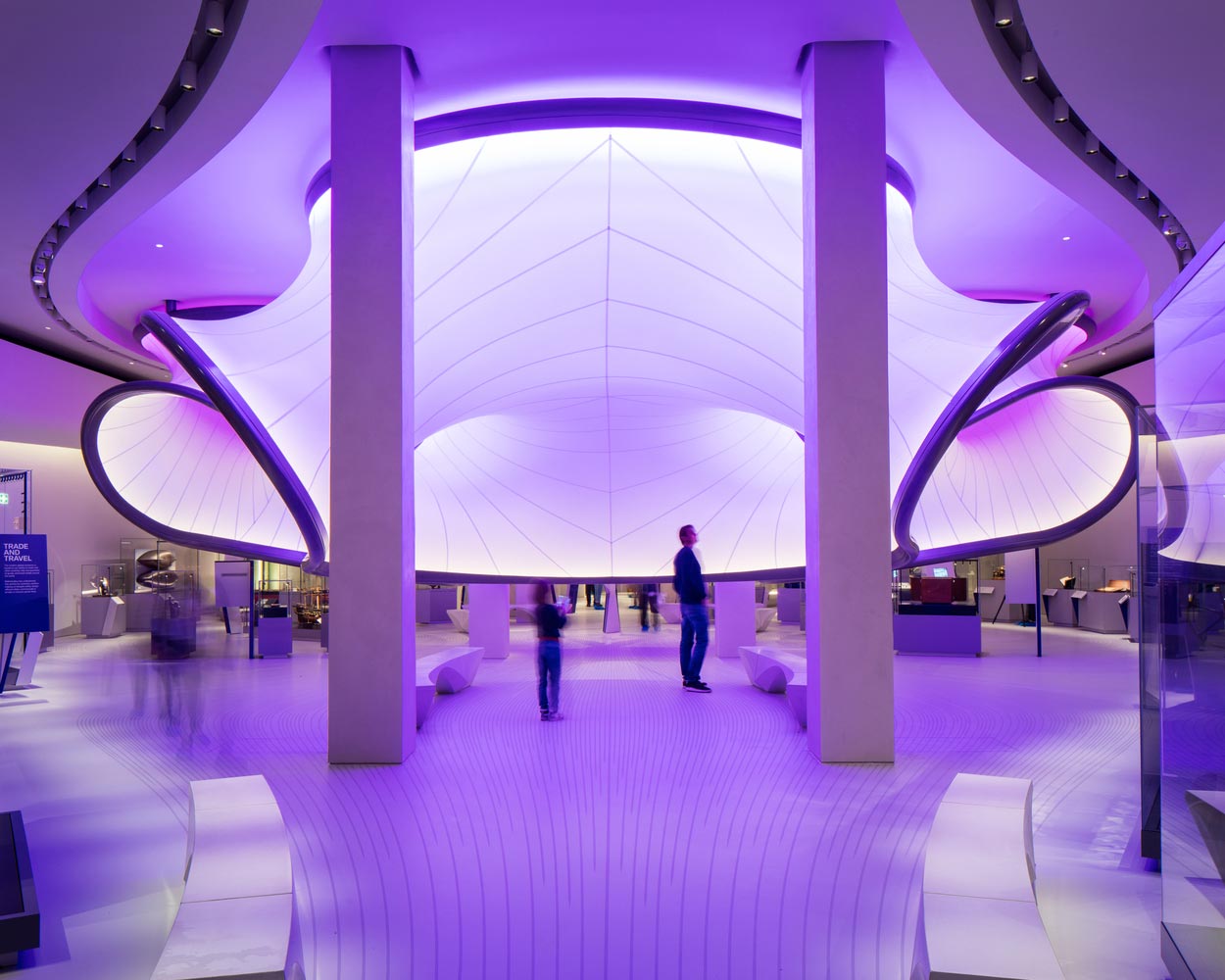

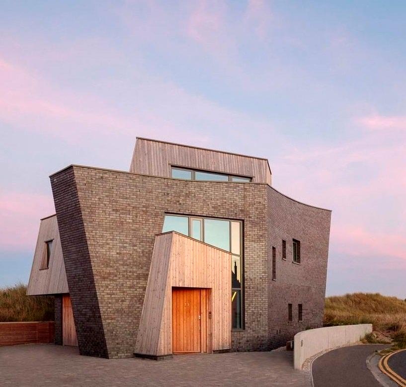
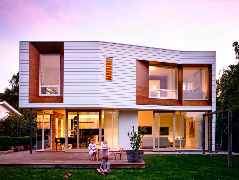
For me the color Very Peri is softer, more lyrical, more dreamy. It's the reflected light of a sunset in the trim. Hues of lavender, delicate violet, and a peek of pink undertones look particularly effective on white facades and on houses finished in dark steel.
