Color of the Year 2022 — Very Peri
The Pantone Institute has named the color of the coming year. In the past the color was chosen from the existing palette, but this year the team created a brand-new one.
The color of the year for 2022 is PANTONE 17-3938 Very Peri.
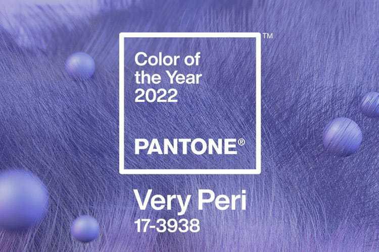
According to Laurie Pressman, vice president of the Pantone Color Institute, "the color of the year reflects what is taking place in our global culture," so amid the wave of emerging from isolation while also pushing the boundaries of the virtual world, the experts created a new color that blends the "constancy" of blue with the "energy and excitement" of red.
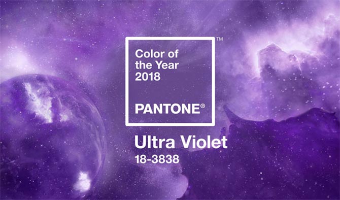
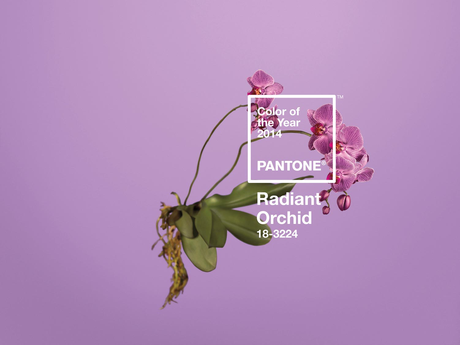
It's a new color, but you can spot a certain cyclical pattern in these picks: four years ago, in 2018, the color of the year was Ultra Violet, and in 2014 it was Radiant Orchid.
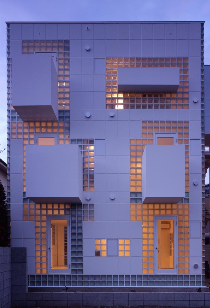
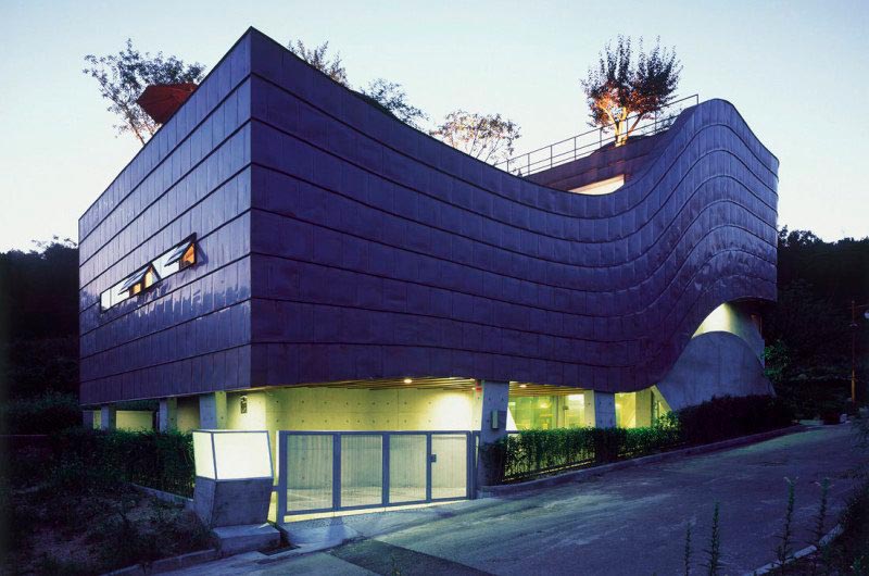
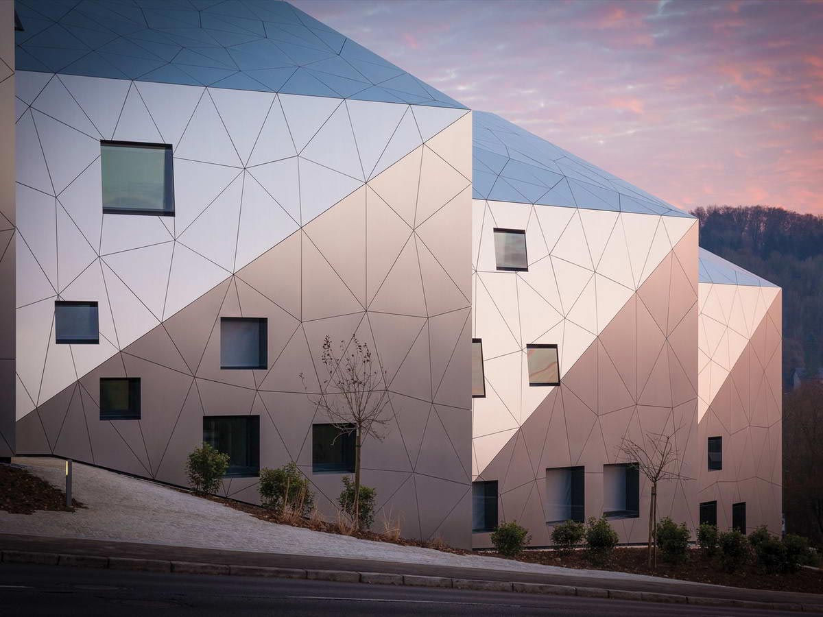
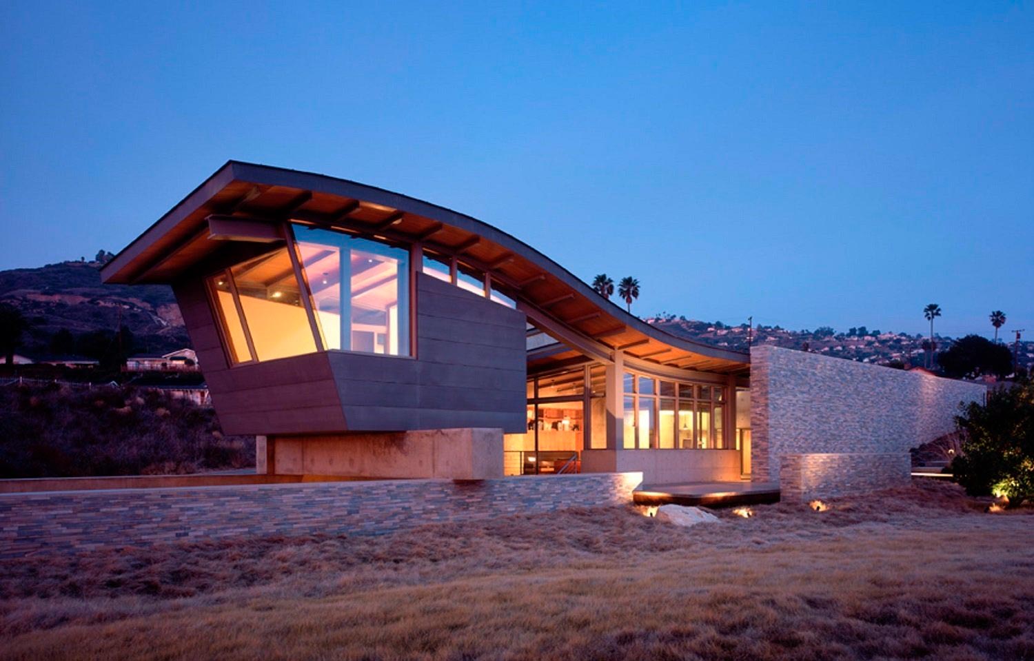
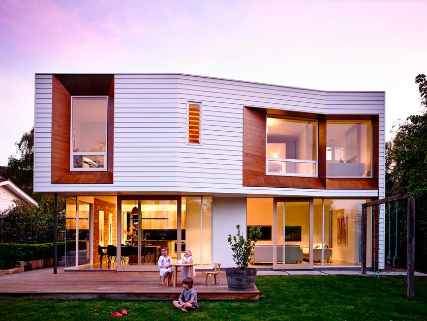
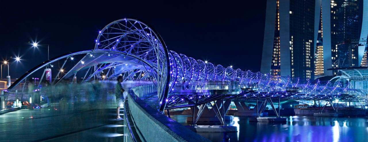
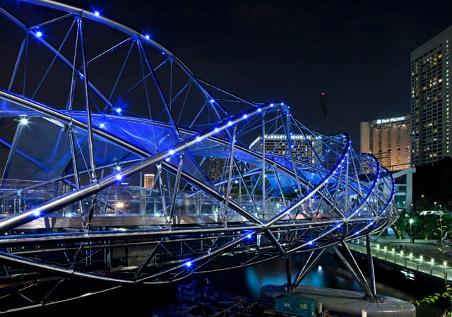
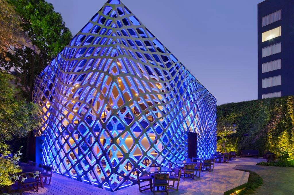
In architecture, this color works well on futuristic forms as accent lighting.
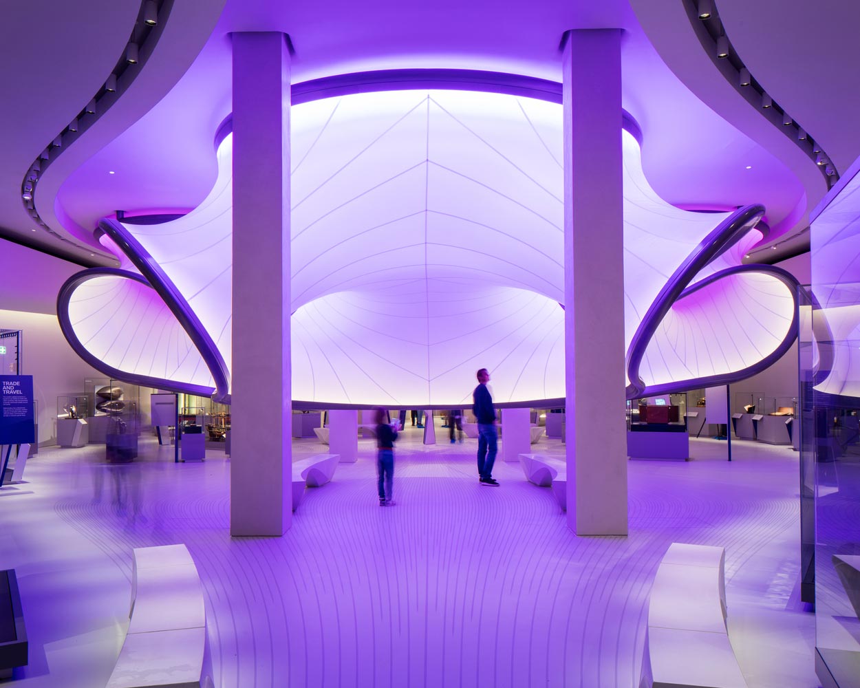
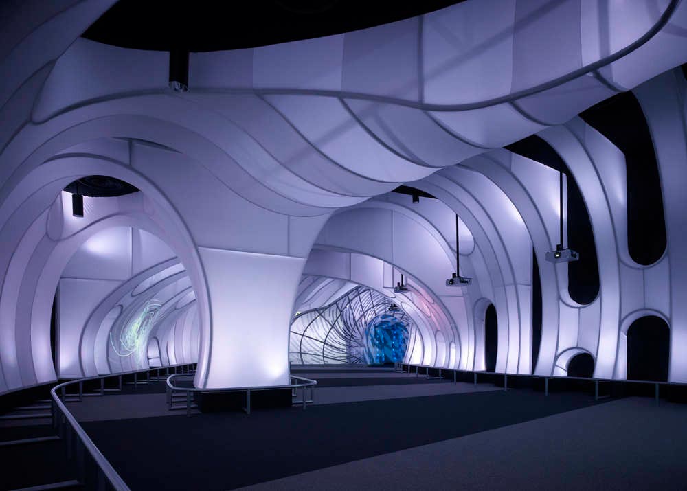
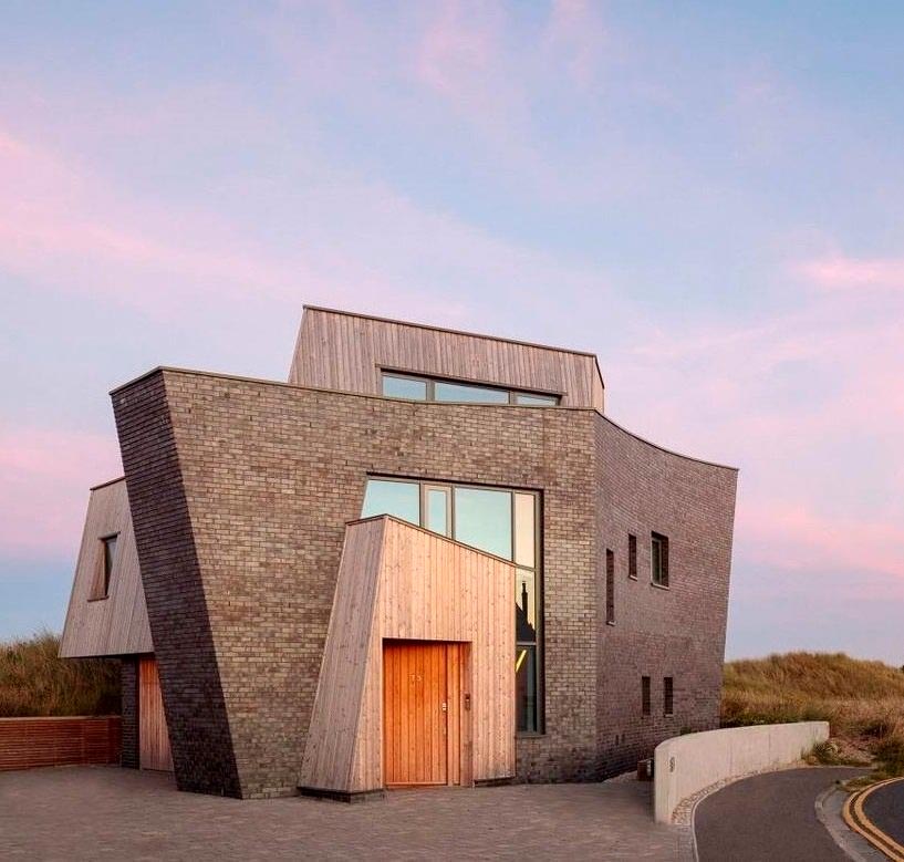
To me, Very Peri feels softer, more lyrical, more dreamy. It's the reflected light of a sunset on the trim. Hues of lavender, delicate violet, and a hint of pink undertones look especially striking on white facades and on houses finished in dark steel.