Visual aggression in architecture
Humans automatically explore all visible space with saccades - cyclically repeated rapid eye movements. Saccade autonomy was discovered in 1987 by Doctor of Biological Sciences Vasily Filin. His experiments proved that the process is involuntary and does not depend on the presence of objects for consideration.
The saccade pattern (a pattern of movement) is primarily dependent on the conditions of the visual environment. We cannot control the saccadic eye movement, but are forced to "obey" the visible images.
The revealed pattern shows that many modern constructions and interiors become a problem for health (we exclude outdoor advertising, architects are not to blame here).
At the Moscow Video Ecology Center, visual hazards are divided into two groups::
- Homogeneous visual fields – when there is practically nothing to look at, due to the lack of sufficient visual details.
- Aggressive visual fields – evenly distributed identical visual elements.
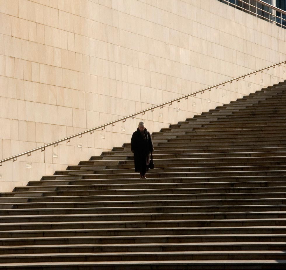
Bilbao, Spain.
Homogeneous fields are found on our streets and inside our homes. As a result of smooth finishing materials and primitive architectural volumes, the straight contours and large monotonous planes of structures do not give the eyes support after each successive saccade, while the amplitude of forced eye movements increases dramatically, causing discomfort and fatigue. Over time, the homogeneous environment causes disorder of the binocular apparatus, accommodation, on-off receptor system.
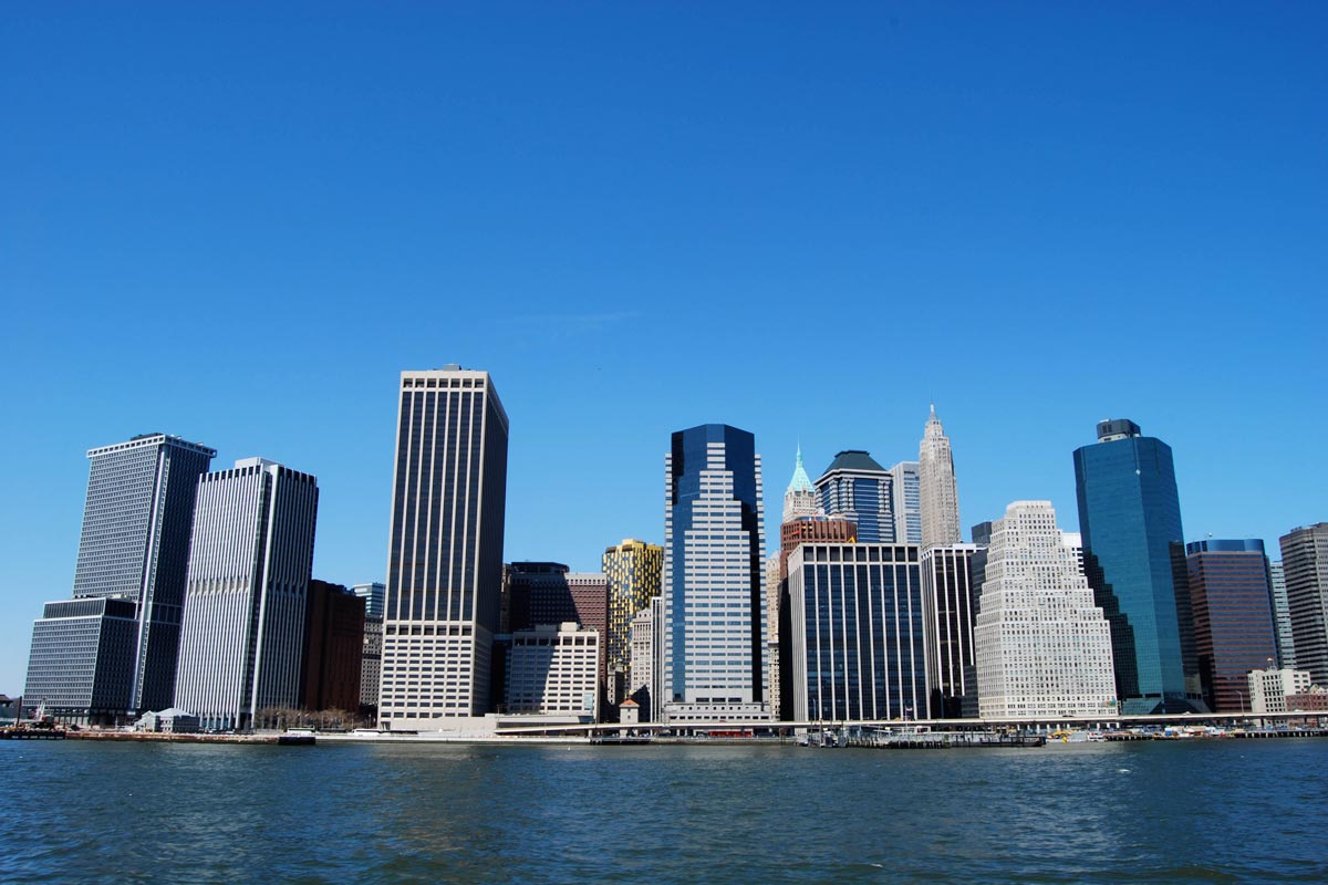
Aggressive visible fields are not uncommon either. They begin in bedroom communities with hundreds of identical windows on every facade and reach frightening proportions in some modern structures and small architectural forms. Probably everyone knows how unpleasant it is to look at the contrasting checks or polka dots on clothing fabrics, when several elements fall into the area of clear vision of the retina. The effect is the same here. In addition, because of the uniformity of parts, it is difficult for the brain to piece together the left and right images that the eyes receive.
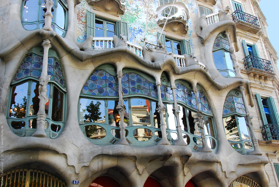
Barcelona, Spain.
Today architecture serves an even more ruthless ideology - the ideology of the brand. Everything here works for exclusivity, originality, irreplaceability of the brand. The city turns into a landscape of competing icebergs. Giant corporations want to demonstrate their success, their reliability with their central offices. But what we get is detachment from the space, aggression to the surroundings, opposition to it. Portfolios of design bureaus are full of original ideas of constructions serving successful brands but not society. The city ceases to be compositionally unified. And the people who live in it cease to be unified.
Both the visualizer and photographers help promote any house projects with beautiful surroundings and special effects. They use bright natural phenomena, photoshopped sunrises, polarized reflections, special lighting, contrast, unnatural angles and similar "spice" construction - just to like the project.
A project beautiful in pictures is realized in life as a dusty mirror box reflecting the emptiness of the winter sky or, worse, the blurred contours of nearby buildings, which makes passersby sad and makes their eyes shiver.
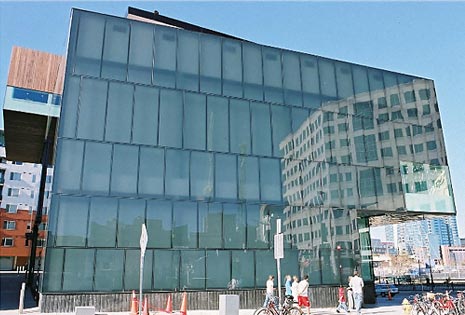
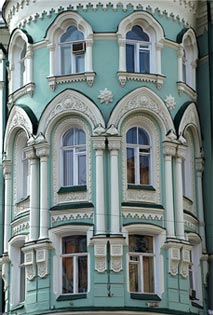
Sometimes brutal modern structures don't look so bad surrounded by existing classic buildings, and can even be a highlight of the neighborhood. But what would these conceptual buildings look like if you changed the scenery around them and built entire cities with them? Huge houses without details seem like artificially enlarged mock-ups, and humans seem like bugs. There is no flowery complexity, the space is dominated by the gray crampedness of cemetery macro-monuments.
An aggressive visual environment makes people aggressive, changing society for the worse. Won't we be responsible for the lives of future city dwellers?