Fake English Mansions in Russia
Living in a classic English-style mansion just outside Moscow is a dream that the city's realtors work hard to keep alive. People often come to us wanting to give their architectural project the look of a fine old house. So what is it that gives new architecture away, despite every effort to style it like an old mansion?
A mansion near Moscow. The color of the decorative elements is far too contrasting. Instead of the three-dimensional modeling that architecture calls for, the facade flattens into a painted picture.
|
English Mansion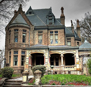 Gentle contrast across all parts of the building. The decorative elements are the same tone as the walls.
|
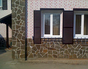 The base course is sharply outlined and overemphasized.
|
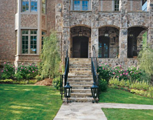 The base course is often left unaccented, even when the foundation is tall.
|
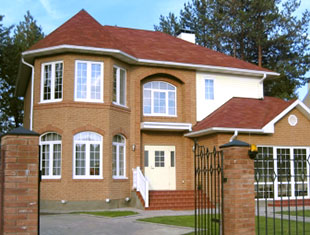 White plastic windows. A harsh, sickly white in the trim creates an unpleasant clash of color.
|
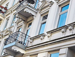 The calm, warm white of the window frames. The trim is painted to match the facade or in other complementary colors.
|
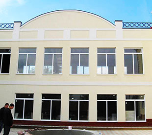 Windows without muntins leave large rectangular holes in the building's facade.
|
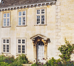 Muntins divide the windows. Double frames are often used to add depth.
|
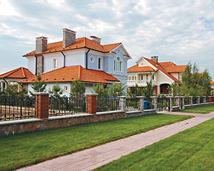 Roof colors that are bright and clash with the facade. The roof color is chosen in isolation from everything else.
|
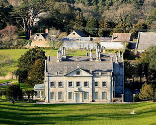 Muted roof colors weathered by time, gray-red with the speckled tones of unpainted shingles.
|
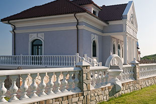 A brand-new look. Overly sharp, perfectly square corners on the steps, walls, and soffits. A showy whiteness.
|
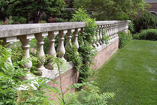 A dignified, weathered look: settled and darkened by age. Worn corners give the building softness and grace.
|
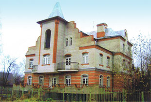 Elaborate facades and a complicated floor plan for a relatively small amount of construction.
|
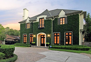 A simple floor plan, as in the classic English mansion.
|
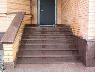 Polished granite and marble entryways on so-called "country" houses.
|
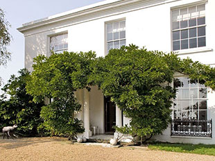 Entryways that are unpretentious yet beautiful. Ceramic tile, pebbles, concrete, gray stone.
|